Task
Design and software development of an financial management system. The main requirements of the project were readability and simplicity of the message.
Solution
Thanks to the wide application of infographics and advanced programming technology, we have created a system that combines usability with aesthetic values.
01 /
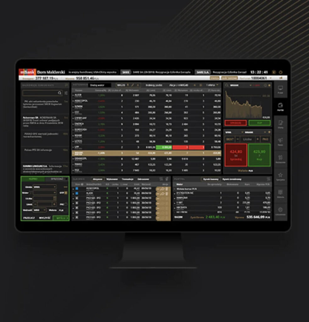
Presentation of investments strategies
Banking is nothing more than a countless number of tables, charts and numbers, to make it easier to read and navigate the application we have used the division of information into sections. This gives users quick access information they seek for.

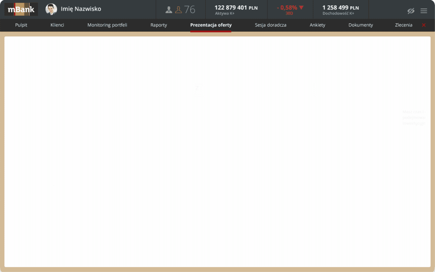
VARIOUS APPLICATIONS OF INFOGRAPHICS
The use of infographics was an obvious solution for us. It organizes information, brings balance, and makes content easier to read.

02 /
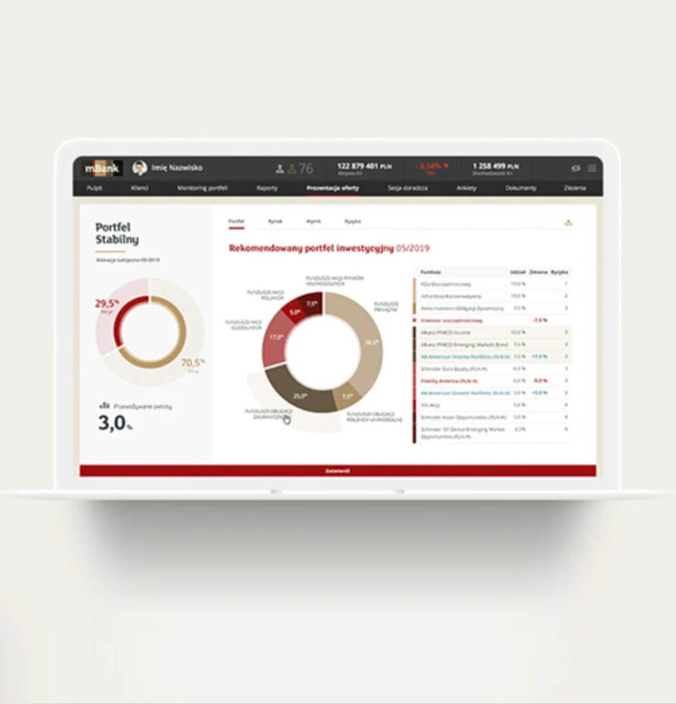
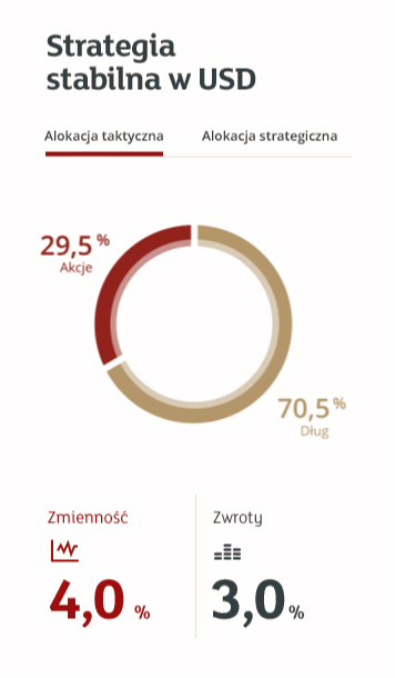
Advisory session - Selection of investment strategy
It is a service consisting in recommending to client financial instruments carefully selected by the team of mWM investment advisiors. Customers have at their disposal a modern transaction service that allows them to freely order transactions, continuous monitoring of the portfolio and tracking changes on a regular basis


THE SIMPLENESS OF THE MESSAGE
When designing the counseling session, we took into account the complexity of information to be forwarded, which is why the project is based on infographics and charts which makes it easier to read.

03 /
Advisiory session - Presentation of the found portfolio
Clients using mBank's wealth management services can choose one of four Fund Portfolios with clearly different levels of risk associated with investing in the stock market. Alone, or in cooperation with adviser, the client decides to divide his funds between four available Portfolios: Aggresive portfolio, Balanced portfolio, Stable growth portfolio, Conservative portfolio.

EXTENSIVE USABILITY
When designing an effective infographic, it's important to realize that our brain is looking for patterns in visual information to help us read information. We used this knowledge to visually organize our information and create patterns that will strengthen our message.


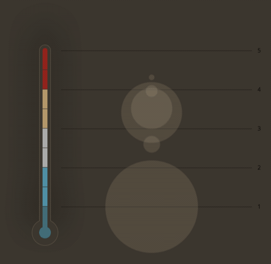
USED ELEMENTS
To organize the content, we used basic designer elements such as borders, lines, circles and squares, making it easier for users to interpret the content.

05 /
Advisory session - Portfolio adjustment
Before the customer's portfolio is automatically adjusted to the model portfolio recommended by the bank, customers may exclude their funds from model consulting. To this end, we have proposed a convenient drag and drop mechanism that allows you to exclude some funds from the model consulting service in a very intuitive way.

Algorithm of adjustment - the real heart of application


THE RESULTS OF CUSTOMIZATION IS LIST OF RECOMMENDED TRANSACTION
Just like lines and borders, colors are important when grouping information, significantly affecting the reading of the order list and organize them into appropriate groups.

Personalized offer

Typography and colors