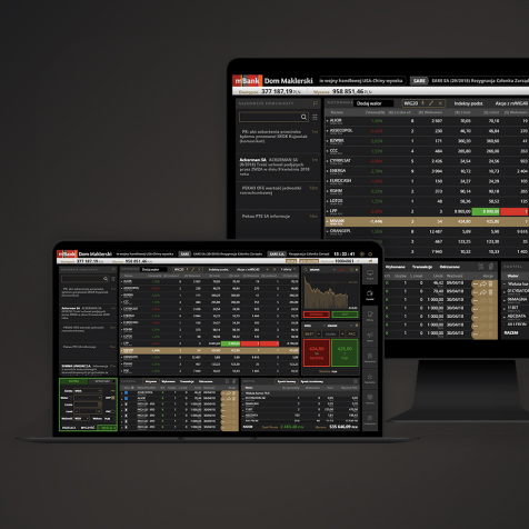


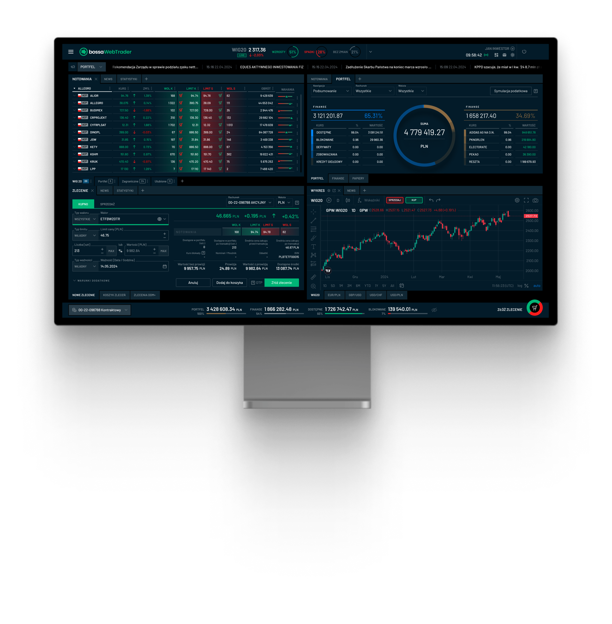
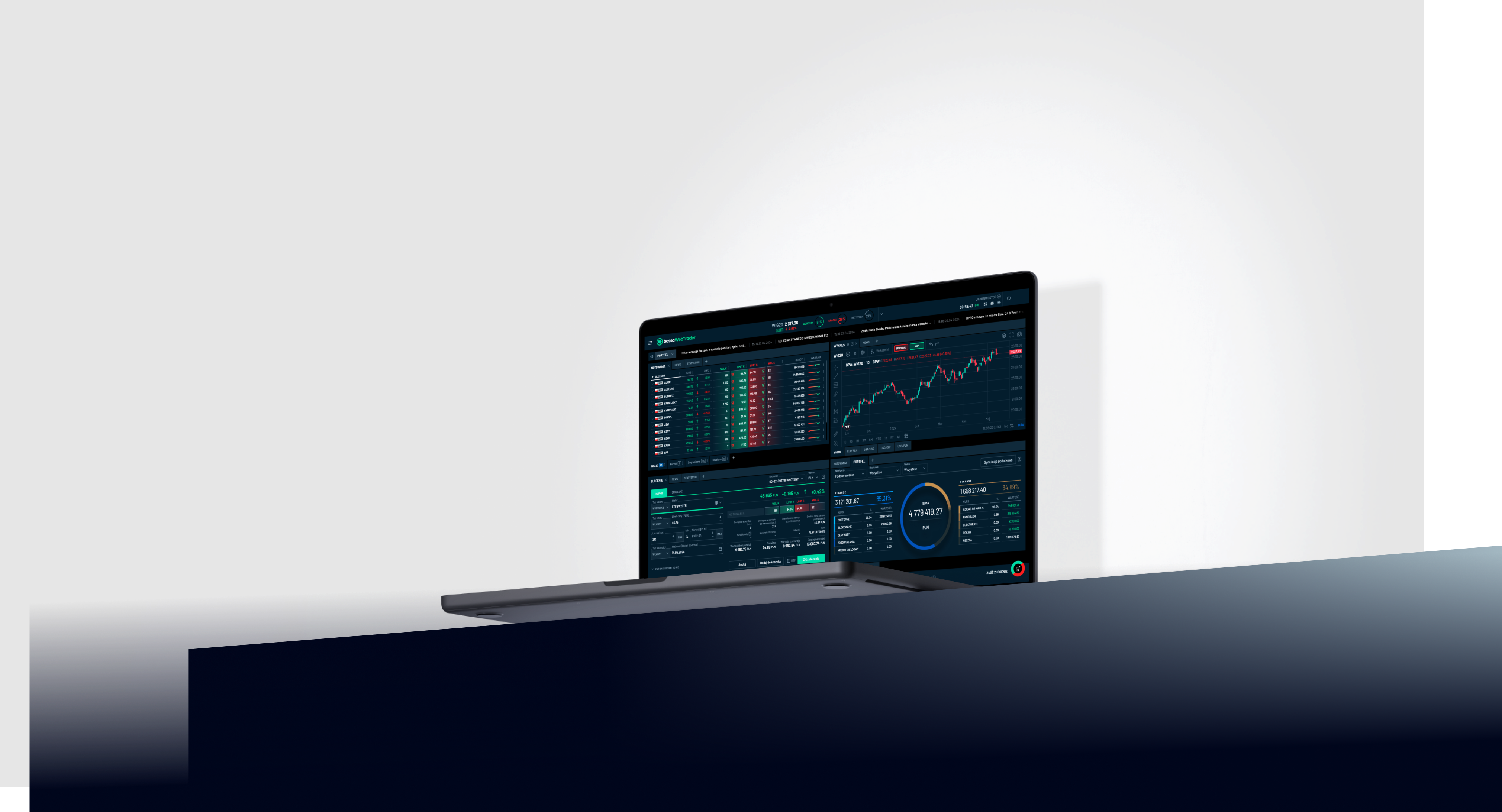
Bossa WebTrader is a modern, intuitive, configurable trading system consisting of functionalities such as: real-time quotes, charts, orders and PAP/ESPI messages.
Goals

The main goal of the project was to create a modern and user-friendly transaction system
Interface design
that simplifies interaction
Organizing the information structure
for easier viewing
Intuitiveness of the navigation system
and effectiveness of user paths
Modern and exclusive graphic design,
based on UX mockups
Intuitiveness, readability of the navigation
and efficiency of user paths
Creating a scalable solution
meeting the expectations of various users
Timeline

Basing the work on a timeline allowed the parties to quickly view the project status, manage deadlines and improved work between teams.

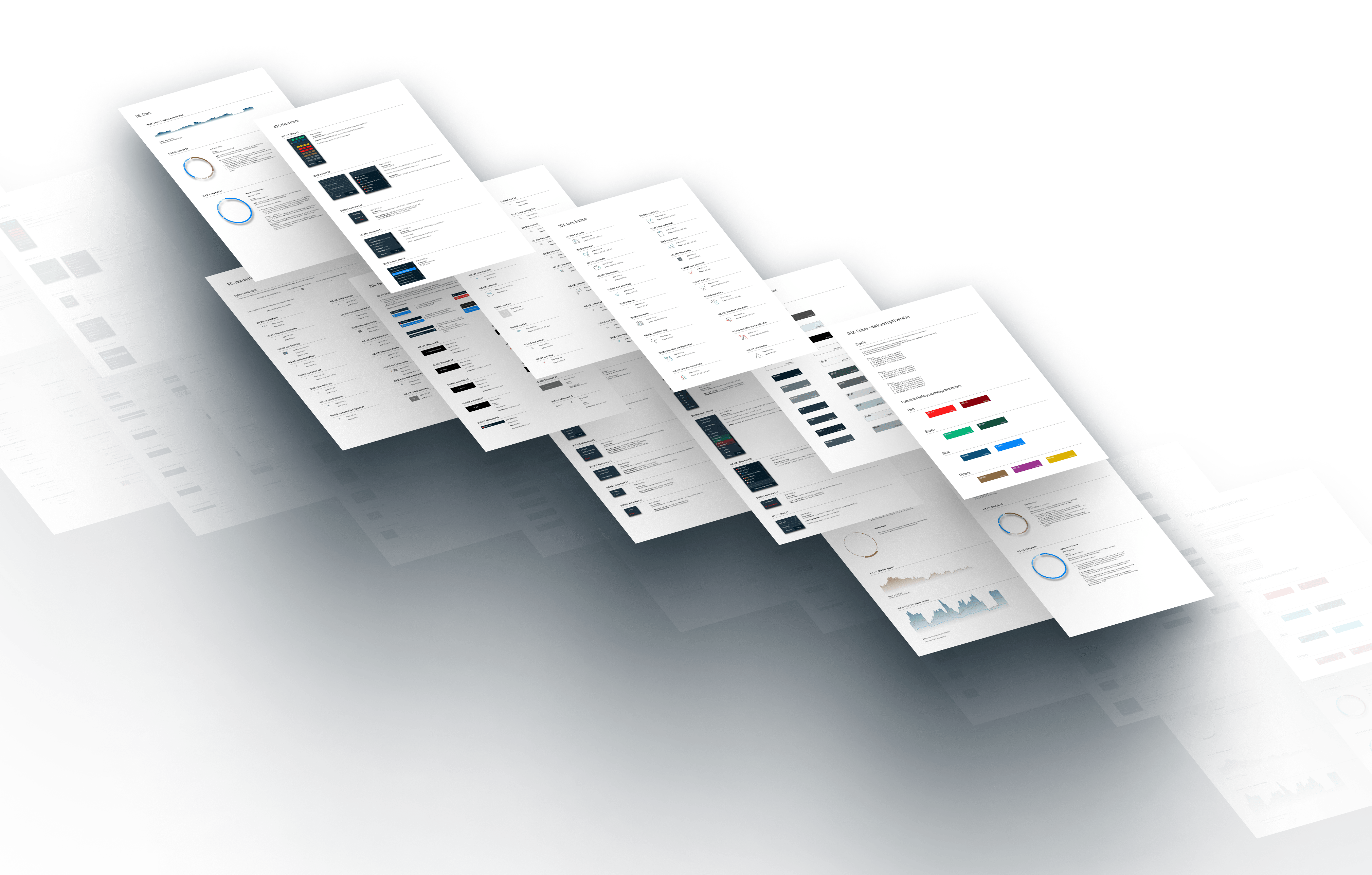
Style Guide

We've created an easy-to-read document that defines the look and feel of the app, including the following elements:
FRAMEWORKS
- grid
- colors
- typography
- gradients
COMPONENTS
- tab
- dropdown menu
- menu fields
- dashboard window
- other input
ELEMENTS
- icon
- icon button
- button
- input
- checkbox
- divider
- badge
- scroll
- chart
- timer
- image
- background
- hint
COMPONENTS
- bars
- data table
- tab
- menu more
- pop up
- section statistics
- place an order
- order book
- wallet
- Calendar
- the news
- OCT order
- settings hub
- tutorials
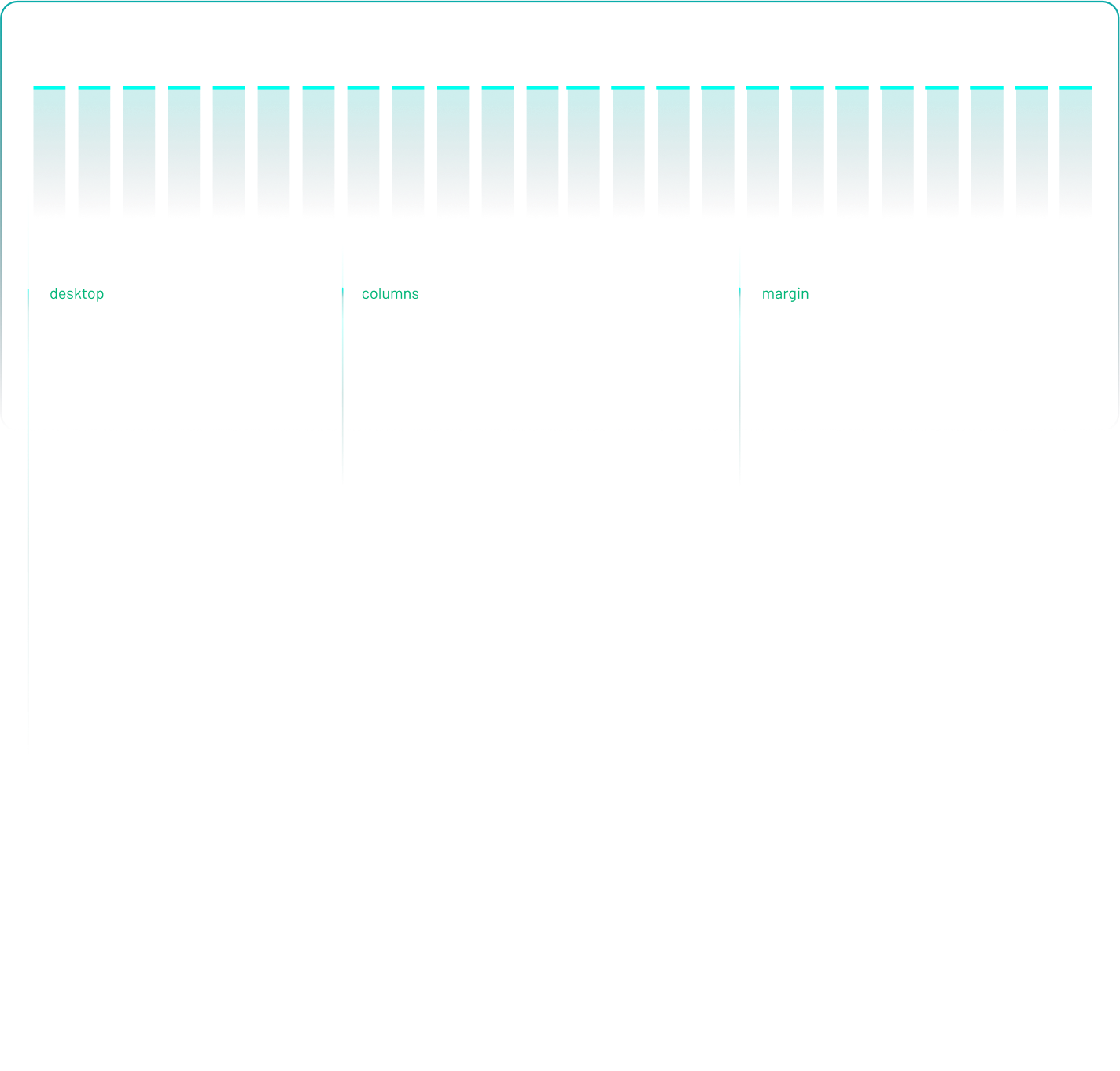
Grid

The design was based on a grid with divisions of 4 or 8 pixels. This makes the application scalable and therefore looks good on screens with different resolutions.
Colors

Researching the needs of the target group and focusing on the project's goals allowed us to create a color scheme that brings the design together and introduces the necessary balance.

Typography

The typeface and the way it is presented set the application overall tone and makes it easier browsing content.
Barlow
ABCDEFGHIJKLMNOPQRSTUVWXYZ
abcdefghijklmnoprqstuvwxyz
0123456789
Iconography

The icon set that we have designed guides user actions and accompanies all necessary steps in an app, which improves the user experience and leaves a lasting impression.
Flexible screen composition options

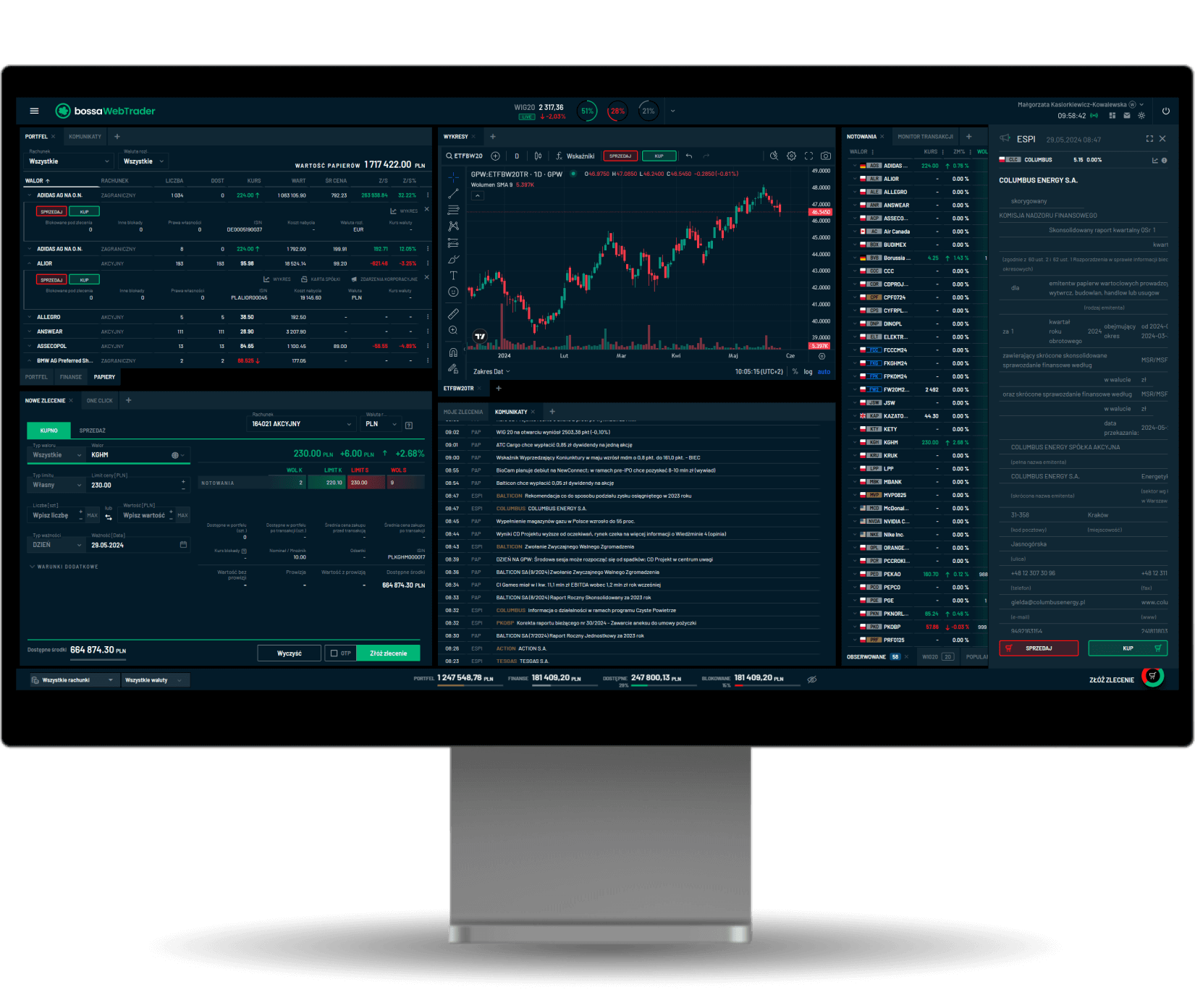
When designing the application window, we took into account the complexity of the information and the availability of functions, which is why the main window is based on widgets that the user can adjust to their needs.
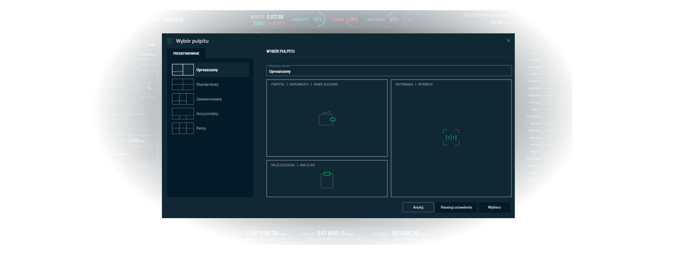


Complete toolkit for investing

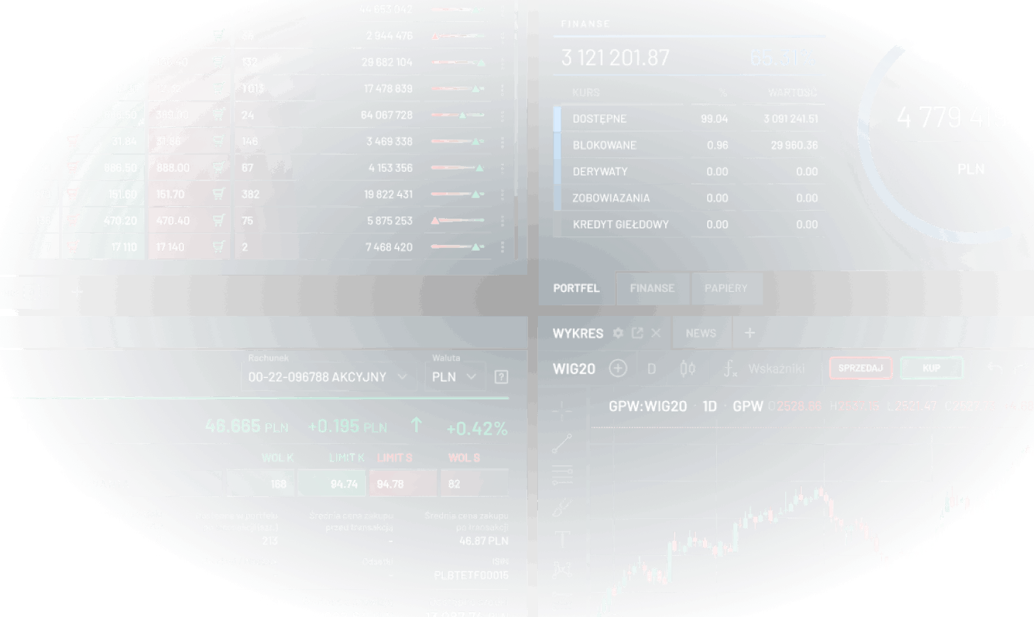
Widgets display content and provide specific functions without needing to open additional application windows. Users can personalize and organize the main window, quickly accessing the information and functions they need.
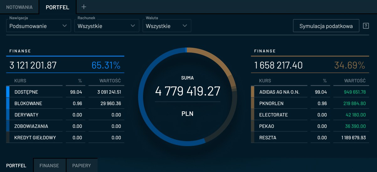
The application allows users to view the assets they hold, both in the context of individual accounts and overall.
The Stock Quotes tab allows users to view the current stock quotes for selected financial instruments.
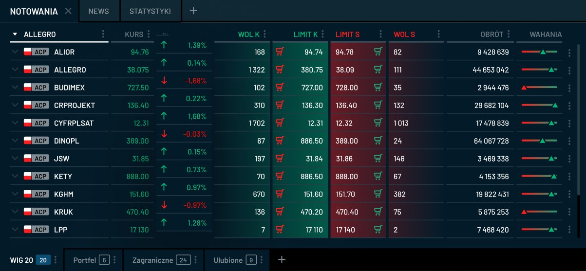
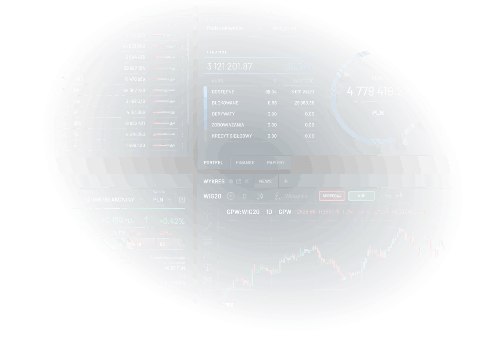
The Stock Quotes tab allows users to view the current stock quotes for selected financial instruments.
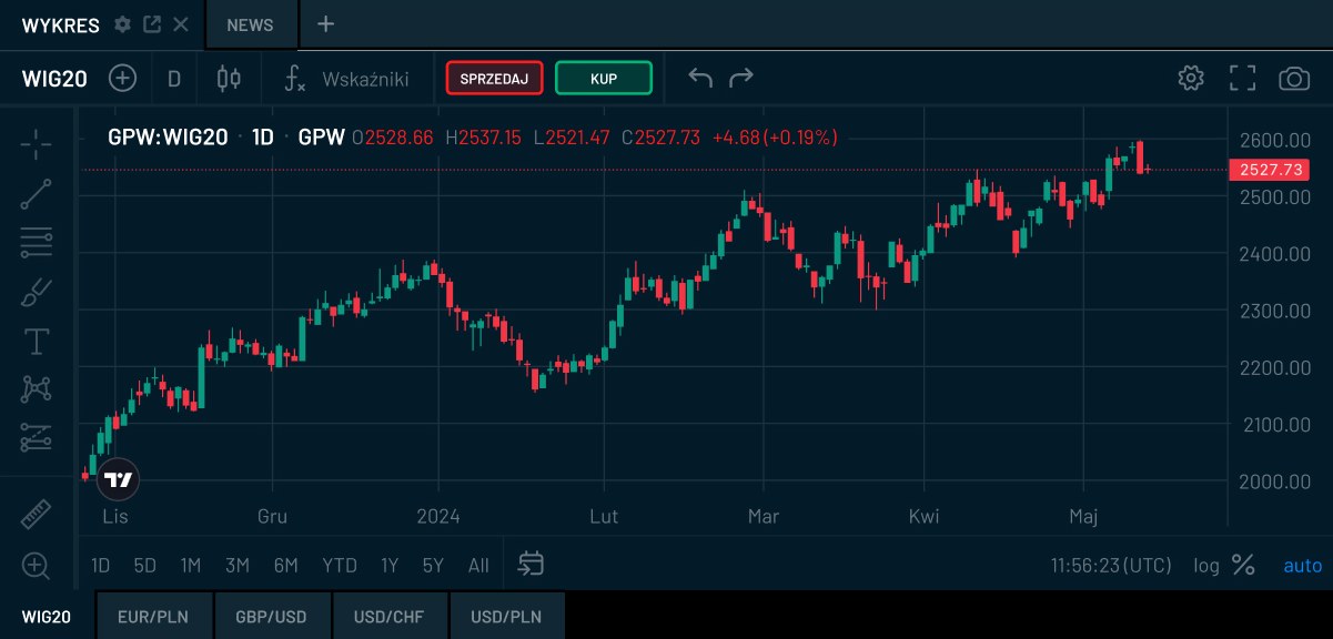
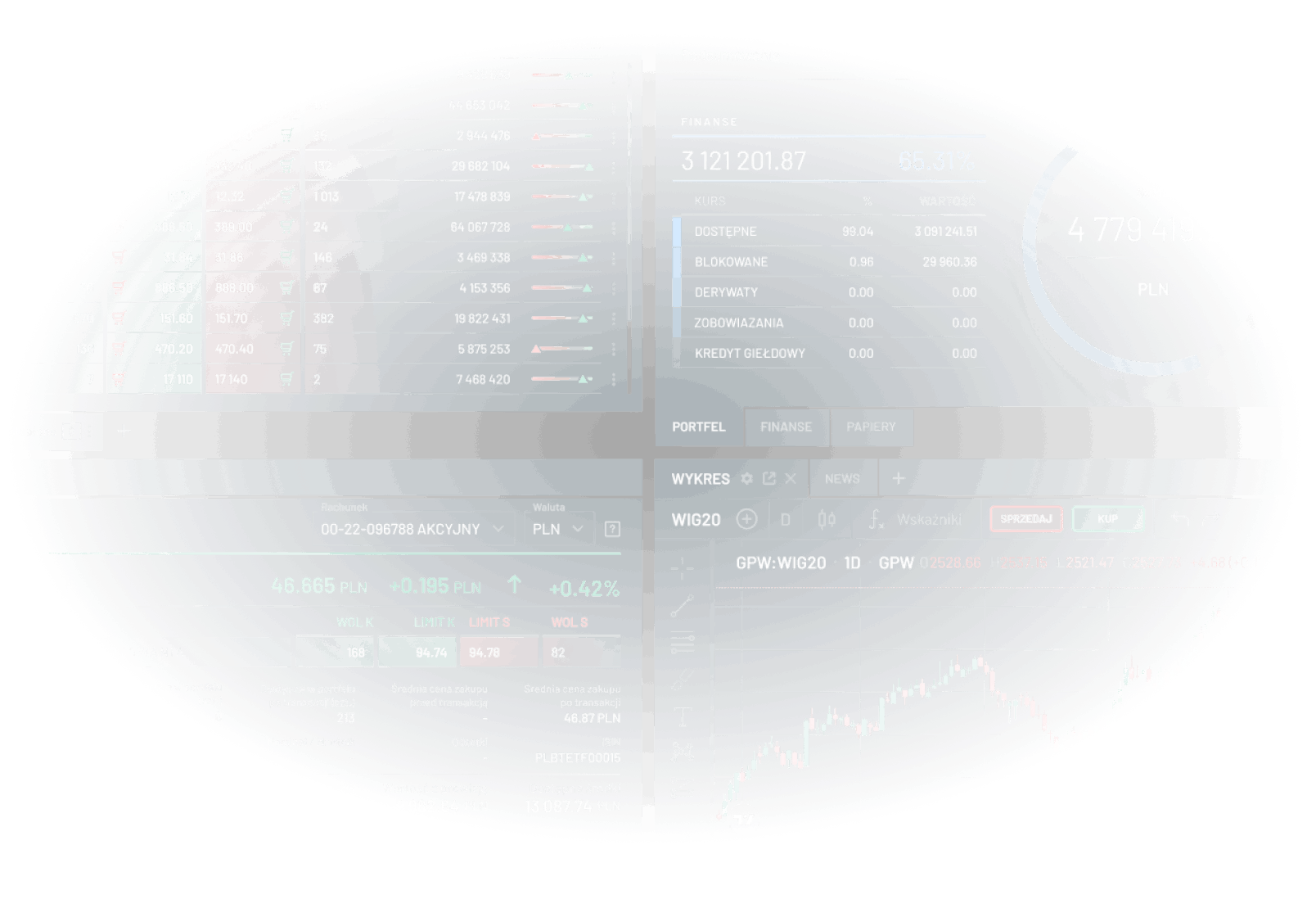
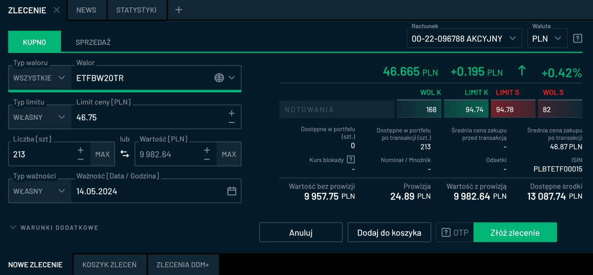
The New Order tab allows you to specify all order parameters available on the Warsaw Stock Exchange.

Placing orders from various places

The application allows users to place stock orders using four methods: the New Order tab, the Place Order format, the format accessed from the quotations table, and the One Click tab.

The most extensive order format allows users to place buy and sell orders, define all their parameters, select the settlement currency, and view auxiliary values.
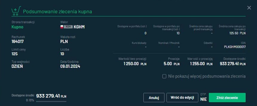
the summary contains all the information presented in the New Order form
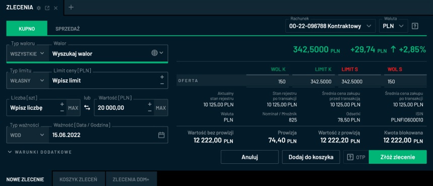
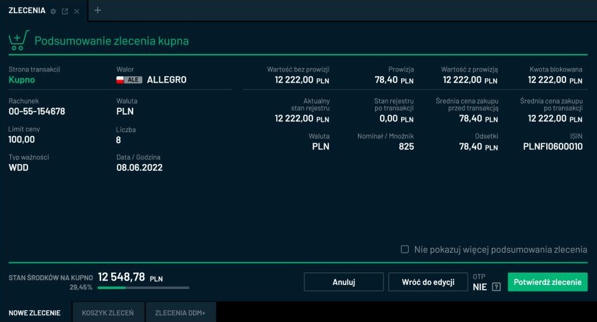
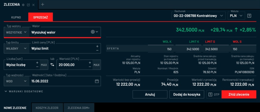
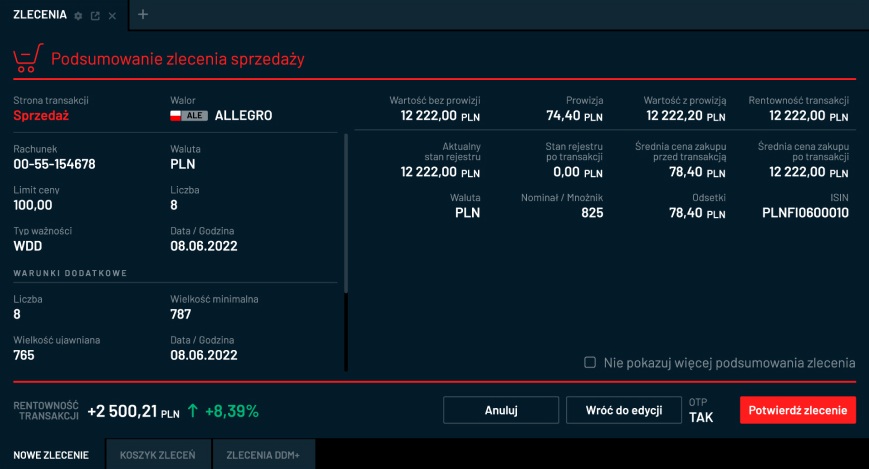
Depending on the selected transaction side, the form is colored green (when buying) and red (when selling).
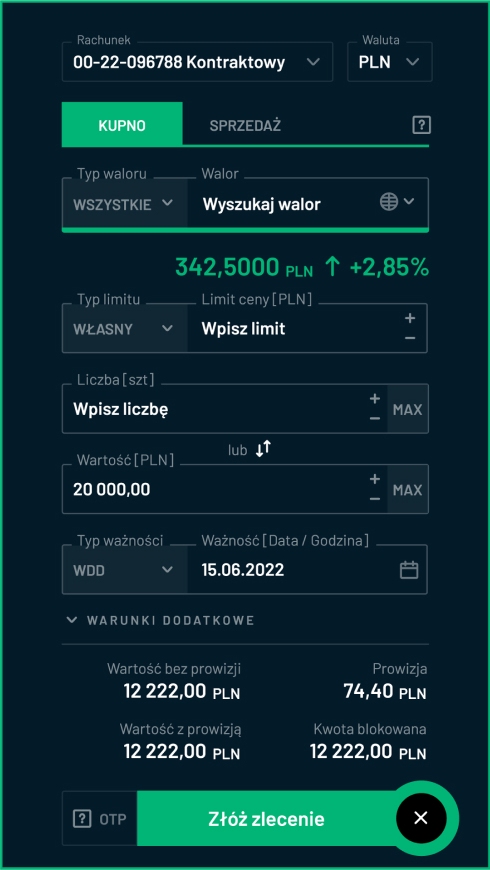
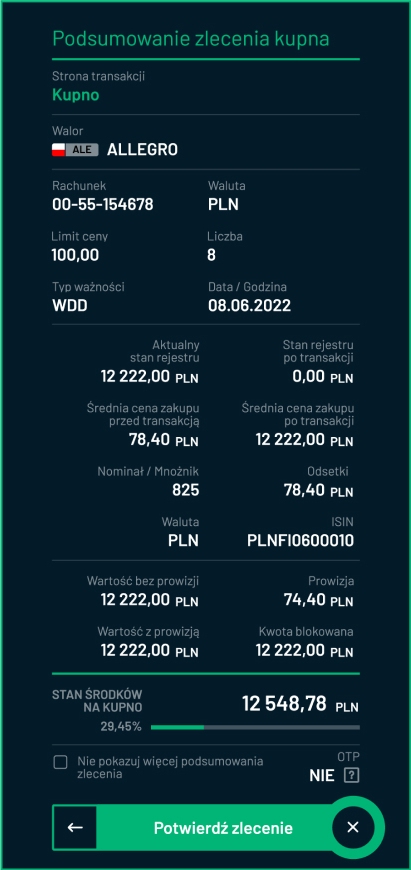
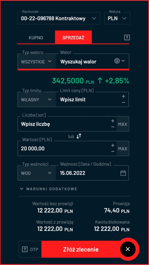
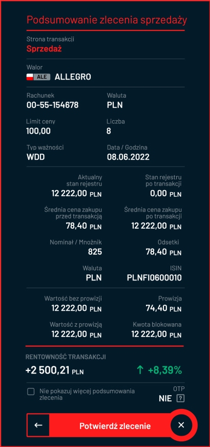
The form's color indicates the transaction side at every step.
The form has a horizontal layout and is placed directly below the row with the quotations of the selected asset.

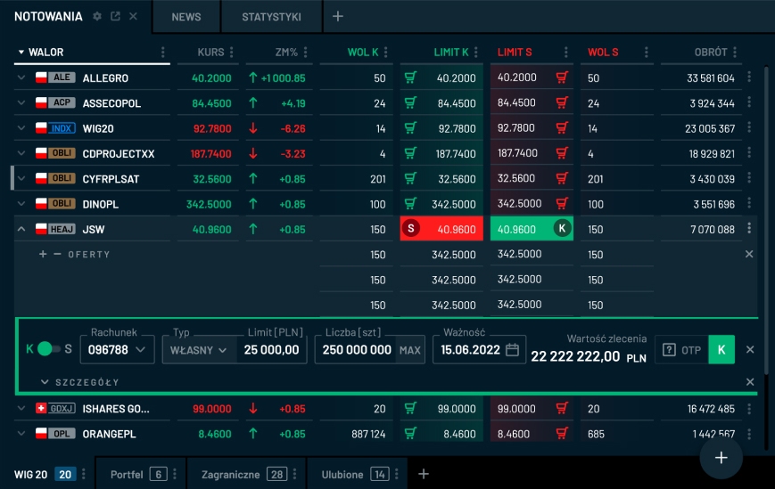
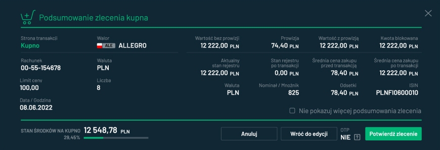
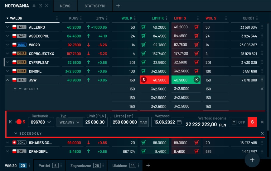
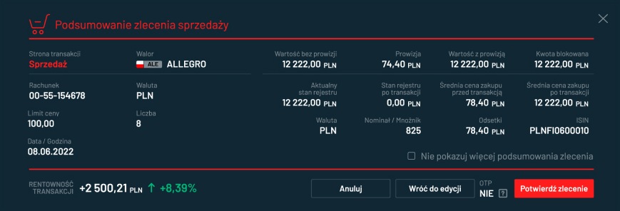
The order summary takes the same form as in the New Ordertab.
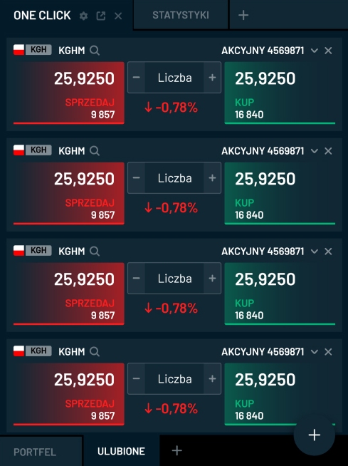
In the One Click tab, you can set up multiple forms that allow you to view the best quotes for selected assets.
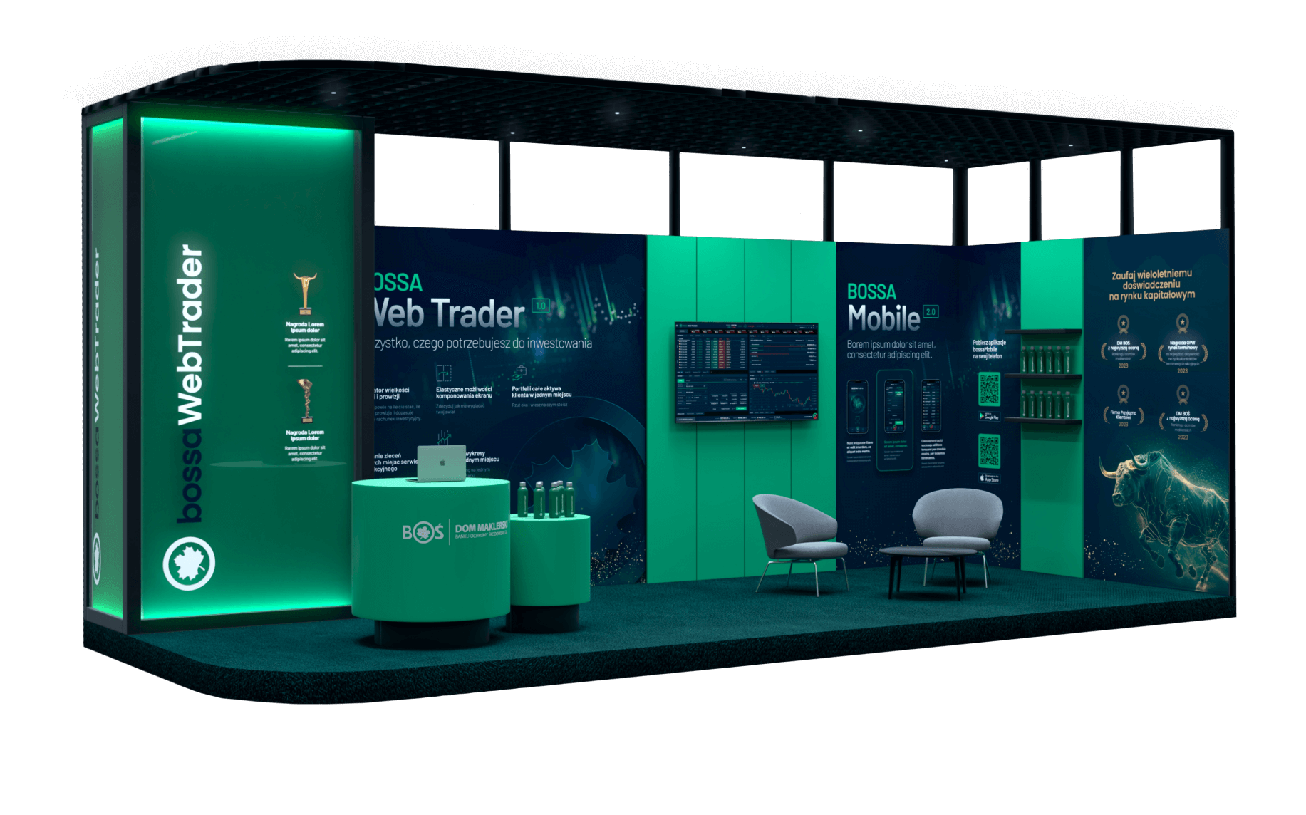
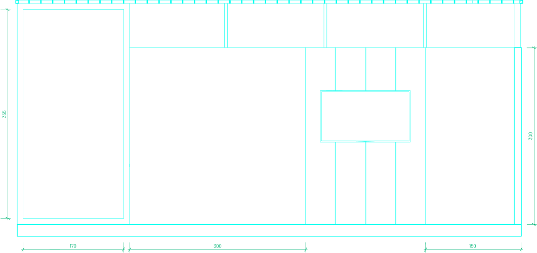
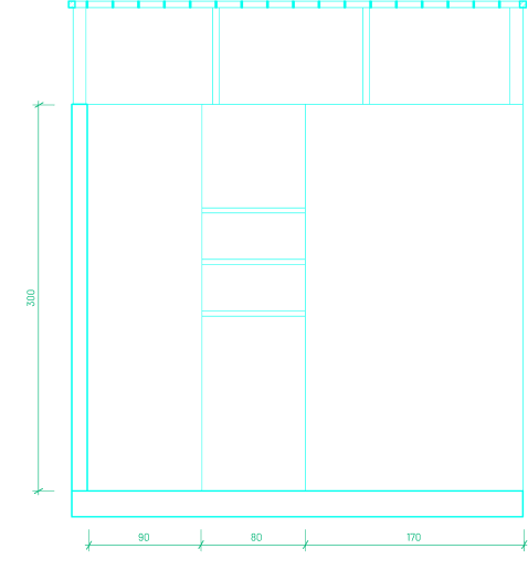
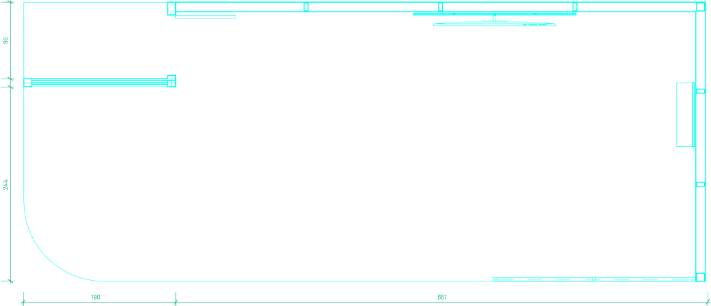
Event Booth

The event booth design is one of the elements of the promotion that we supported after completing work on the application.
Landing Page

Another point in supporting product promotion was designing a landing page that visually harmonized with the application.

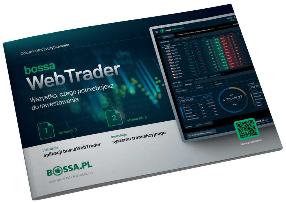
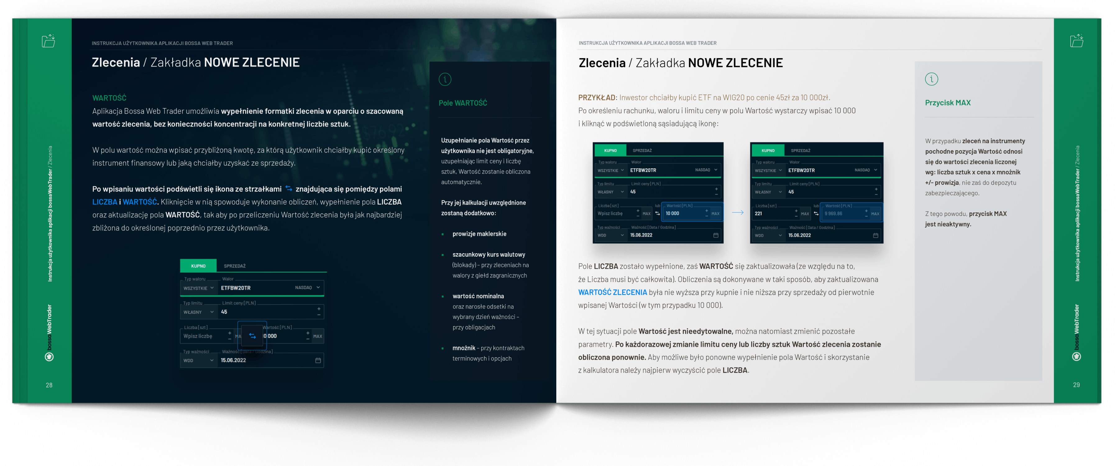
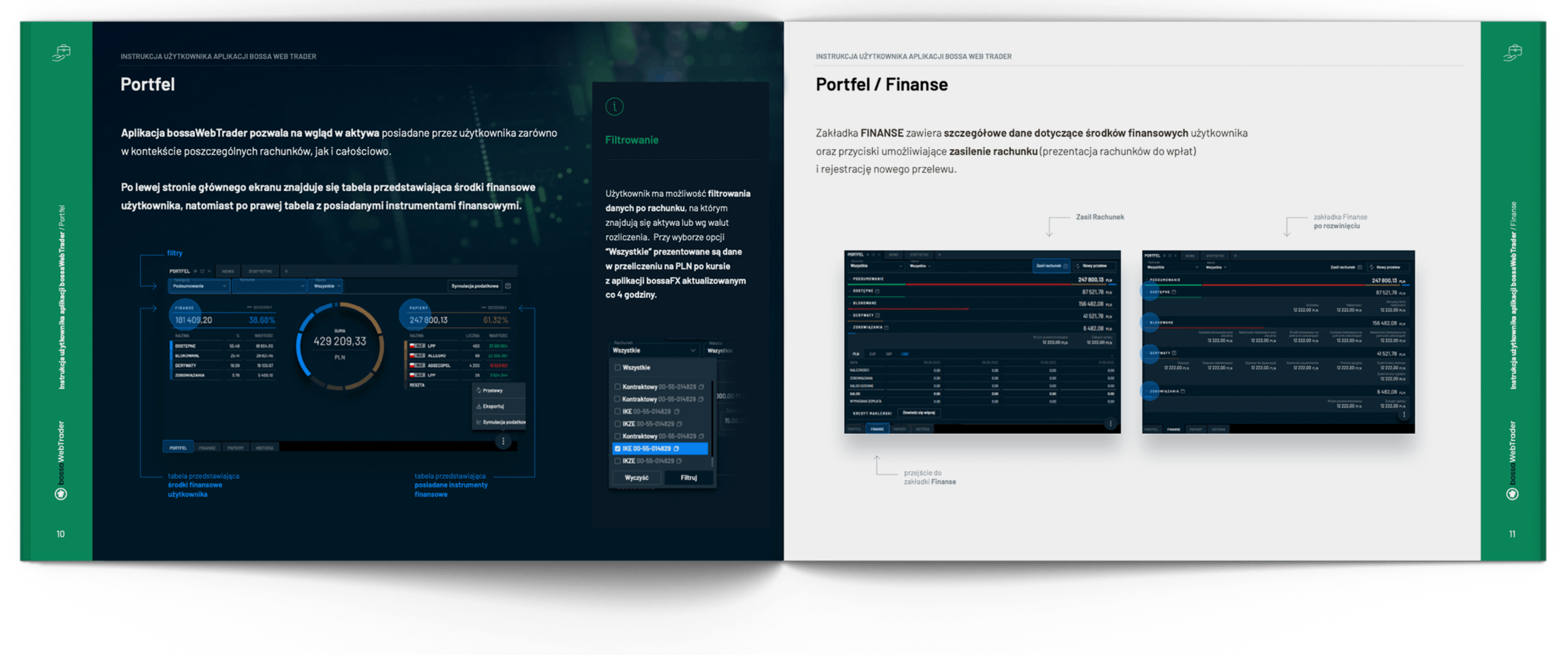
User’s Manual

The guide helps new users get to know the application and provides a summary of the functionality and instructions for the available tools.
