OUR GOALS
User Experience, User Interface, User Flow and Web Design.

Inkospor offer the best nutrients for athletes and active people, which cares about body form and healthy lifestyle.

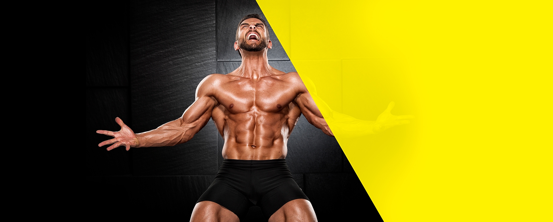
Inkospor offer the best nutrients for athletes and active people, which cares about body form and healthy lifestyle.

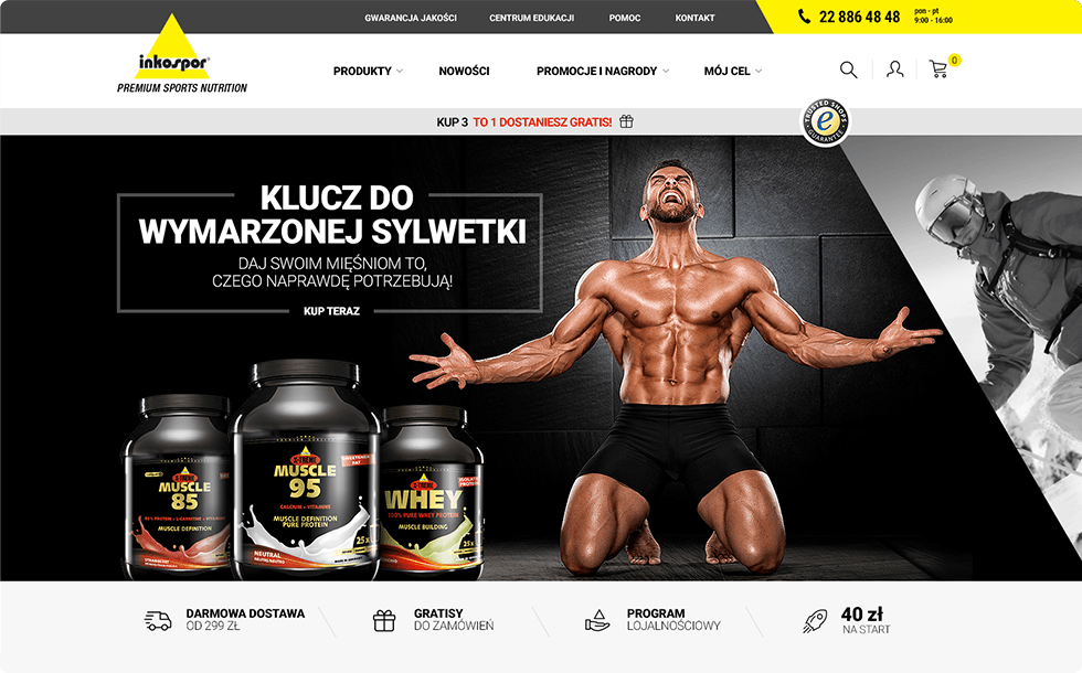


User Experience, User Interface, User Flow and Web Design.
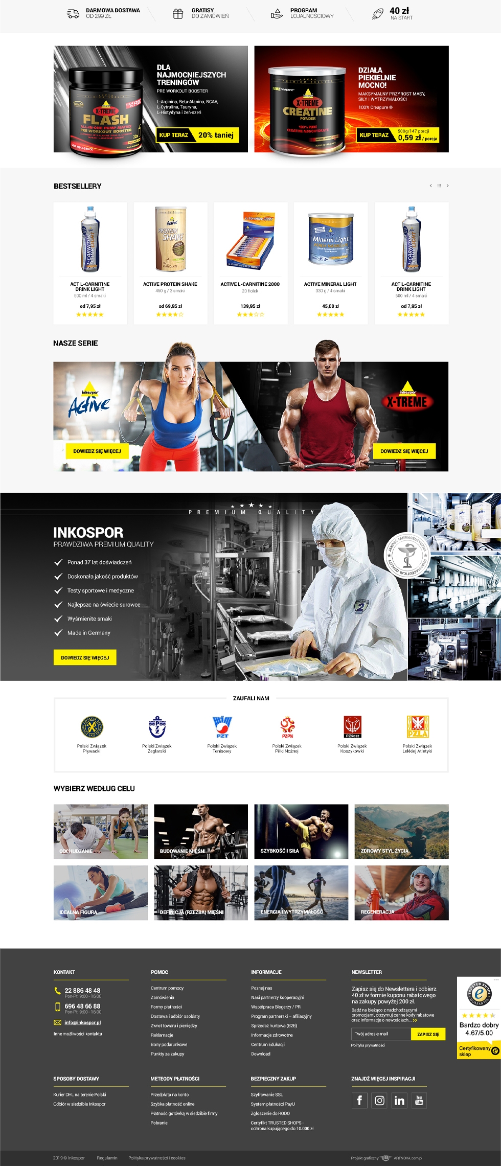
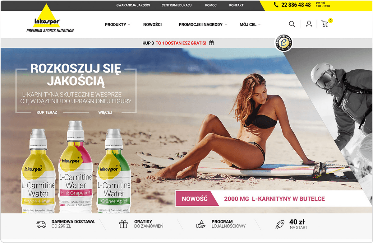
A modern and fully functional page that presents company with an extensive sales platform. We took care of the consistent style of the page, without forgetting about the cleanliness of the message.

Designing a store with over 20 product categories was a big challenge for us. We stood up to the challenge and met the customers expectations. By creating extensive filters and a clear menu, we made sure that users can easily reach the product he is interested in while familiarizing with the store's offer.

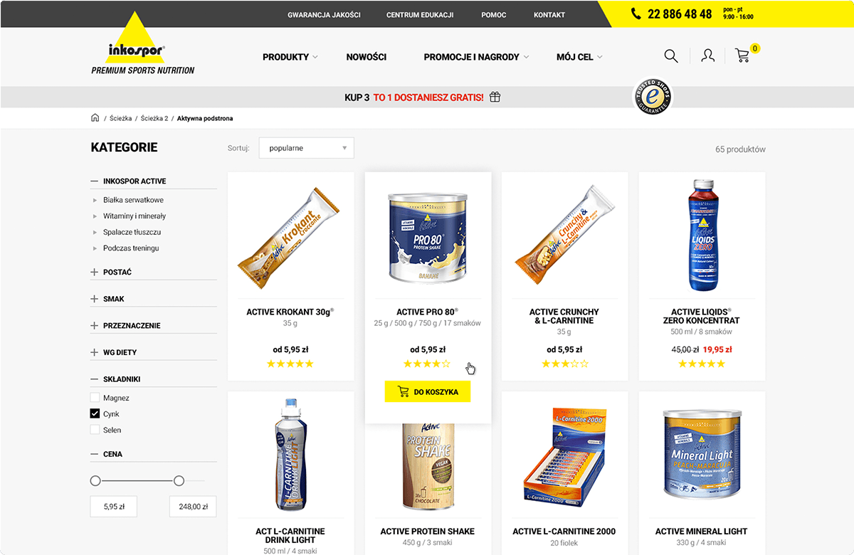

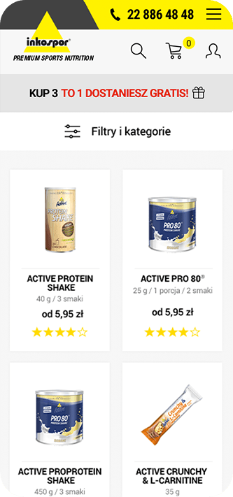

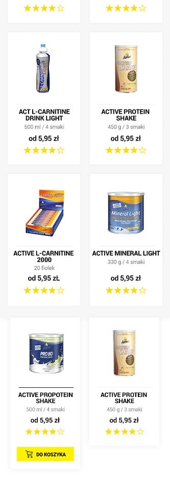
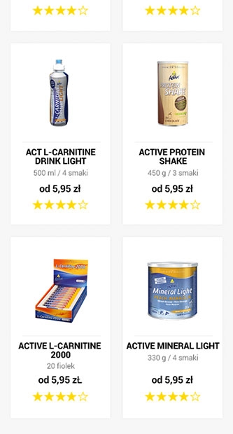


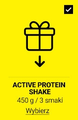

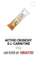

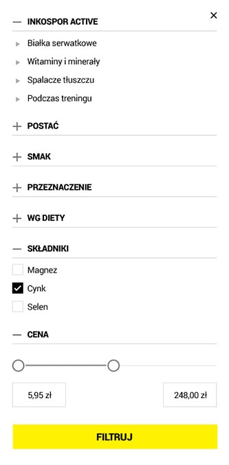


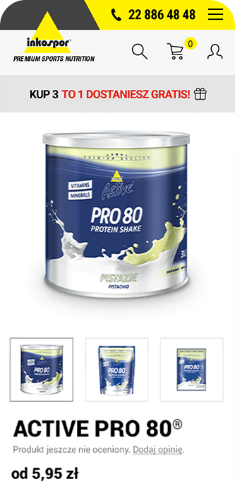

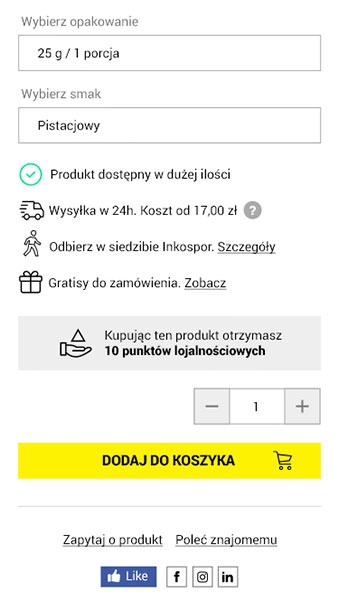
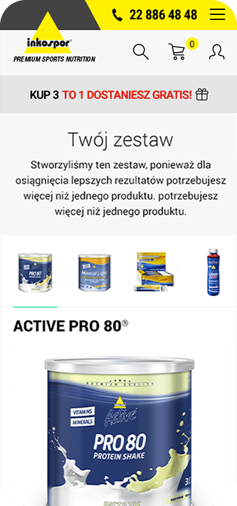
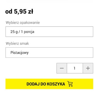
The first step was to present the offer, then we focused on the sales process. By sending clear messages and informing about the stages of the purchase, we made sure that the sales process would not be complicated, and the navigation in the basket is intuitive.


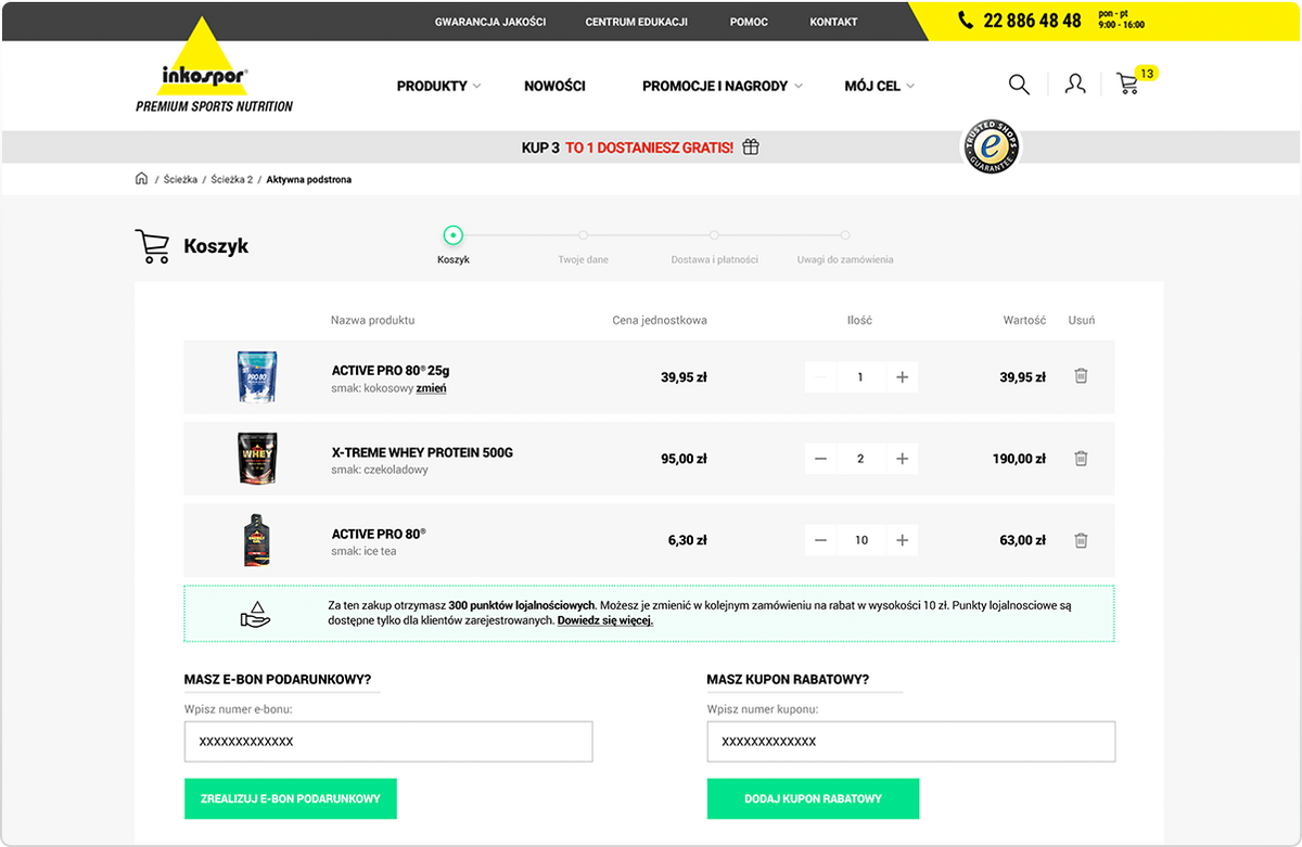


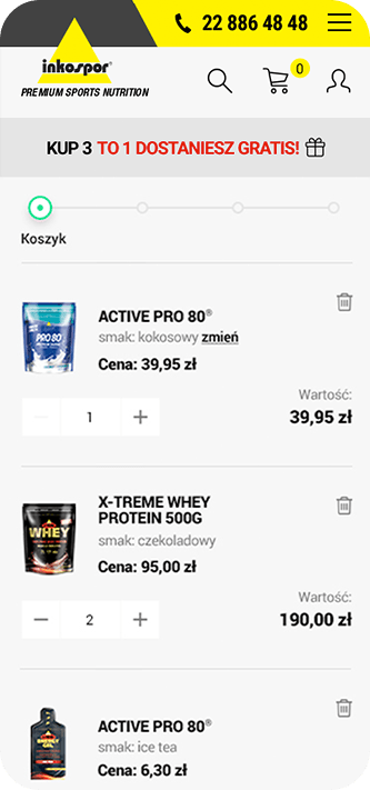



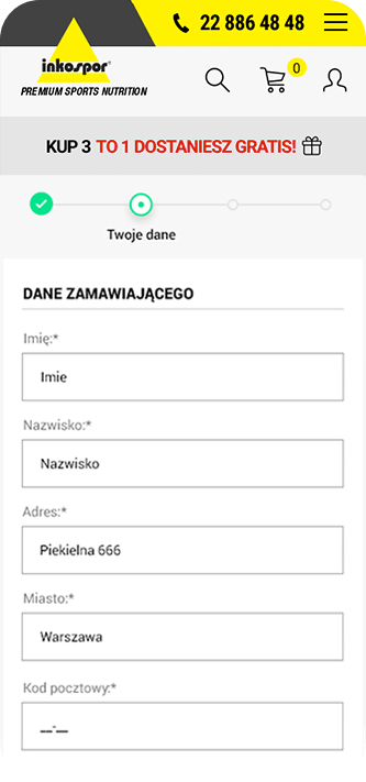

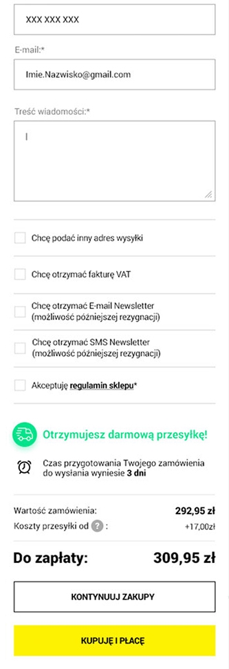



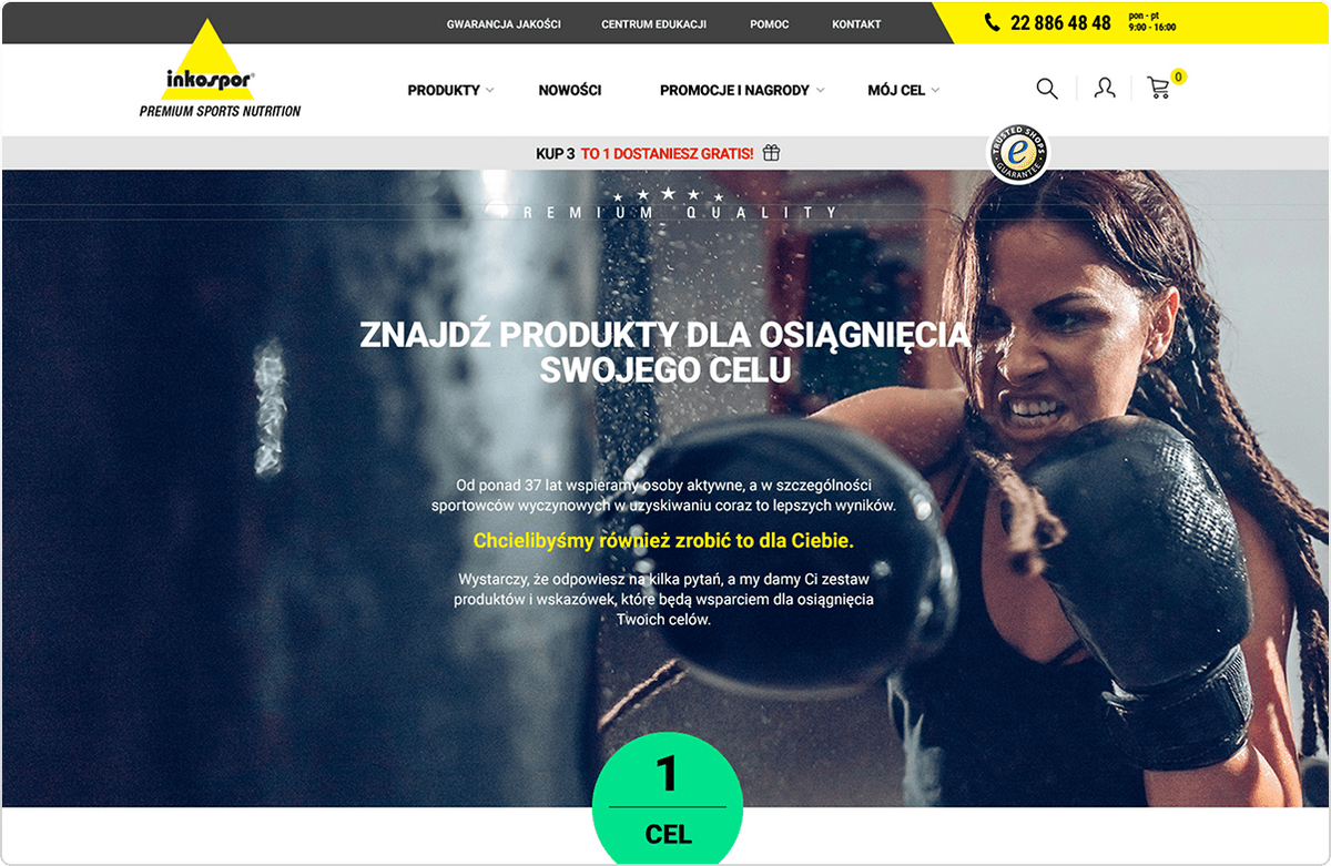
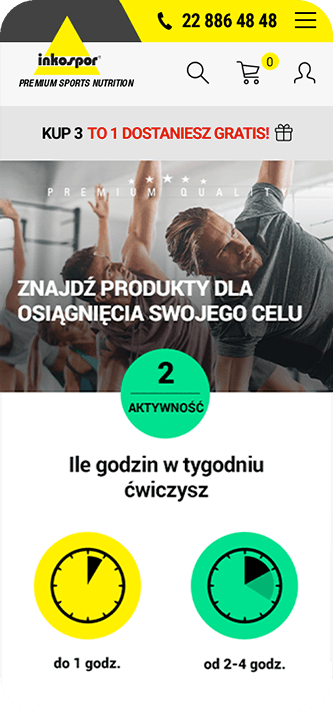
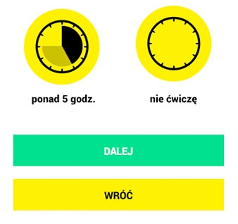
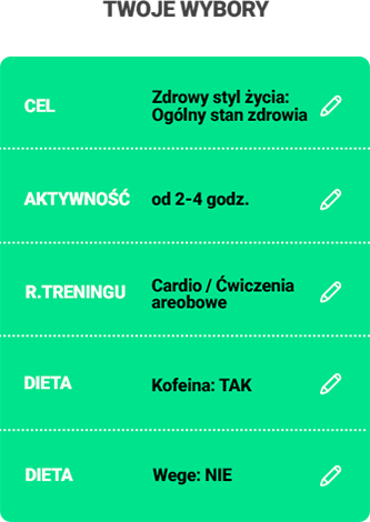
The calculator is nothing more than a test that helps the user to choose the right products for their daily diet, thanks to which they can take care of the figure and improve health. Focusing on the iconographic message, we have created a consistent color and legible design, with the icons that lead the user to further step.

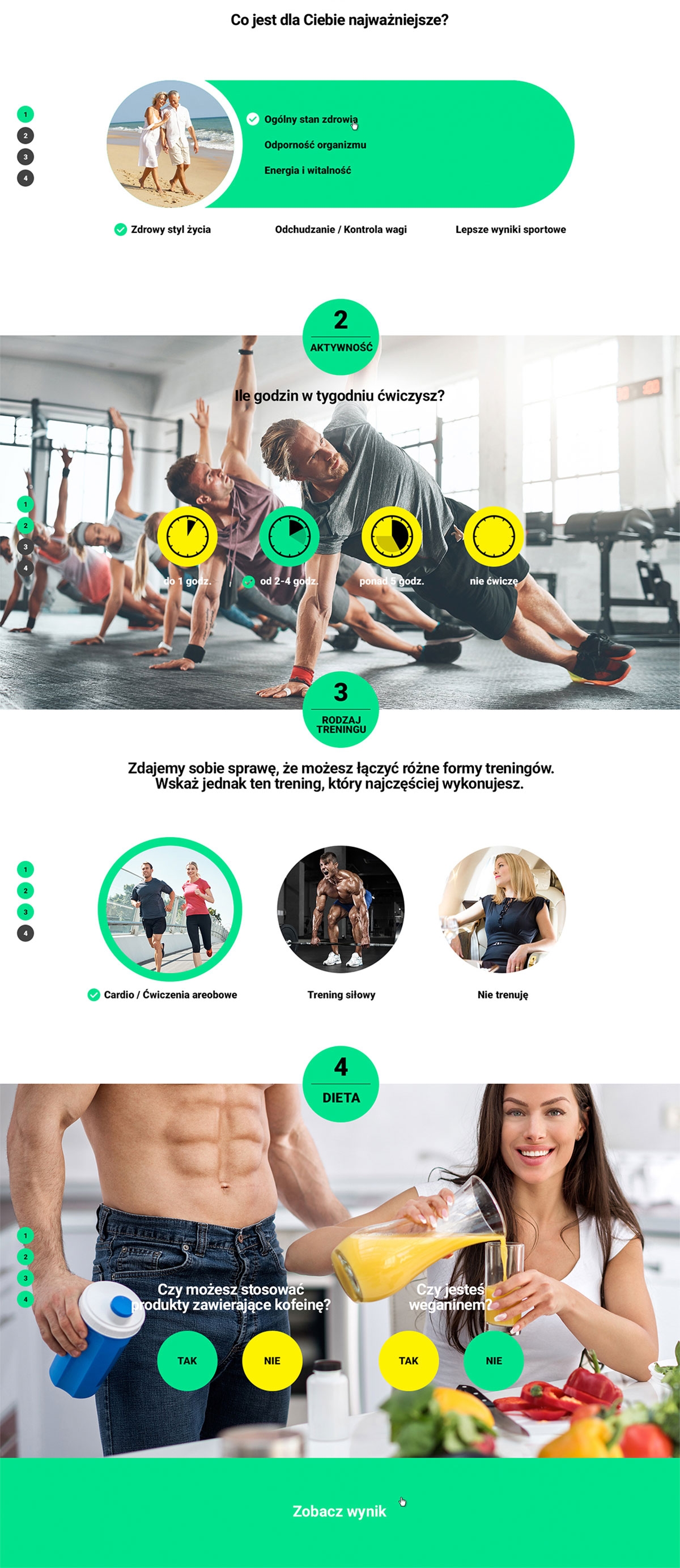










The icons do not differ in style from the colors and font used. The delicate outline and uniform color gives them a classic look, thanks to which they fulfill their navigation function.
When creating 3D visualizations, we take care of every detail bringing the product to a photorealistic version and maintaining the exclusive appearance of the product.

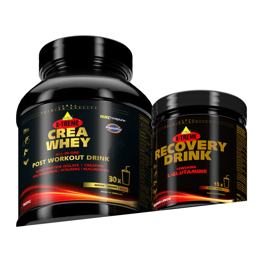
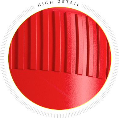
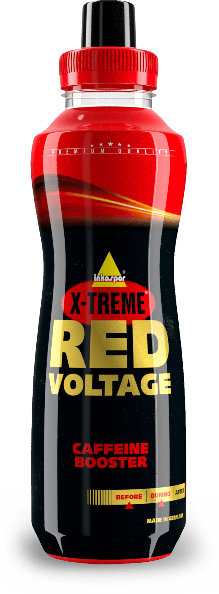
The smallest elements, color texture, adequate light and shadows make the visualization reflect the photographic ideal.
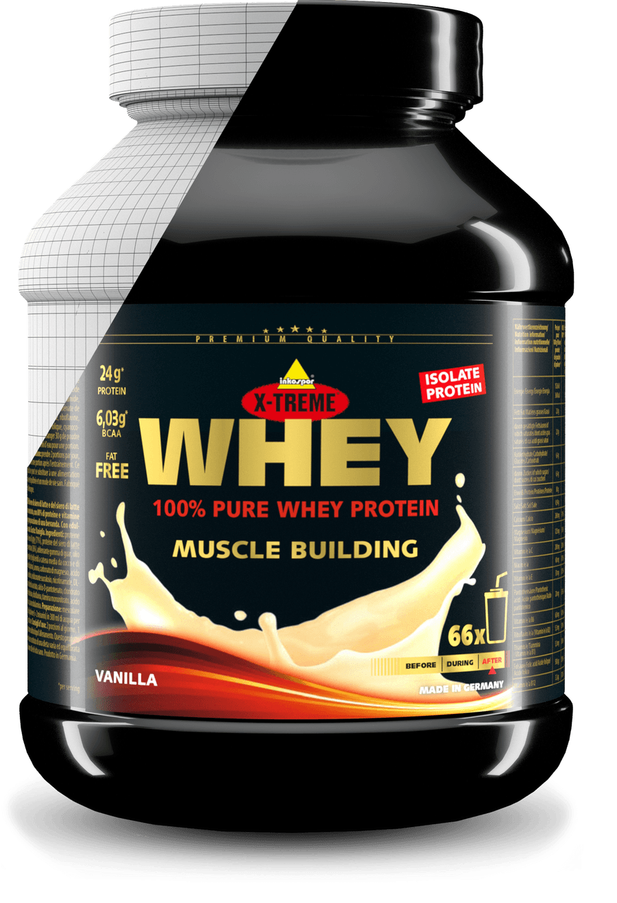
The grid is the base on which the content is arranged point by point. A 3D object is created, with an effect similar to the way the human eye sees.
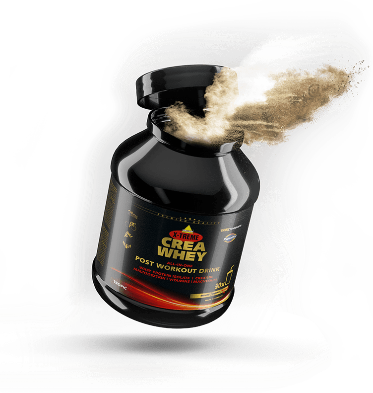
The icons do not differ in style from the colors and font used. The delicate outline and uniform color gives them a classic look, thanks to which they fulfill their navigation function.
When creating 3D visualizations, we take care of every detail bringing the product to a photorealistic version and maintaining the exclusive appearance of the product.


The smallest elements, color texture, adequate light and shadows make the visualization reflect the photographic ideal.

The grid is the base on which the content is arranged point by point. A 3D object is created, with an effect similar to the way the human eye sees.

Porem ipsum dolor sit amet, consectetur adipiscing elit. Nunc vulputate libero et velit interdum, ac aliquet odio mattis.