Hillwood Polska
50+
locations
Hillwood is one of the largest real estate companies that has been building and investing around the world for 25 years. In Poland, is focuses on activities related to the purchase, financing and construction of warehouses and industrial facilities for long-term rental.


Collaboration
During many years of cooperation with Hillwood Poland, we have created countless projects whose level we are constantly improving and adapting to current technical capabilities.
The scope of our activities includes:
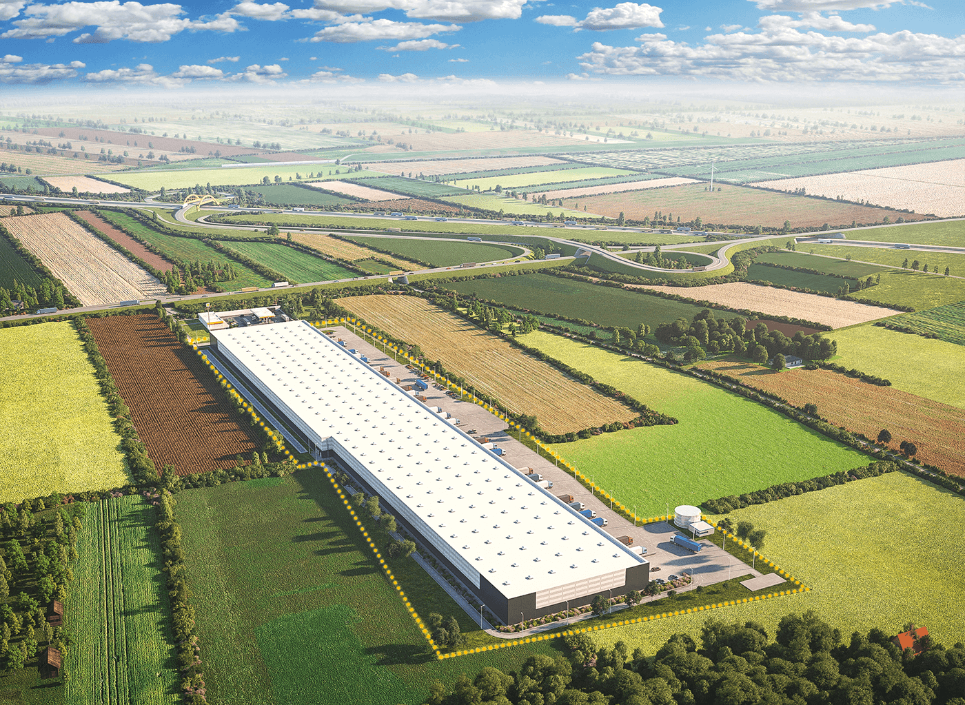
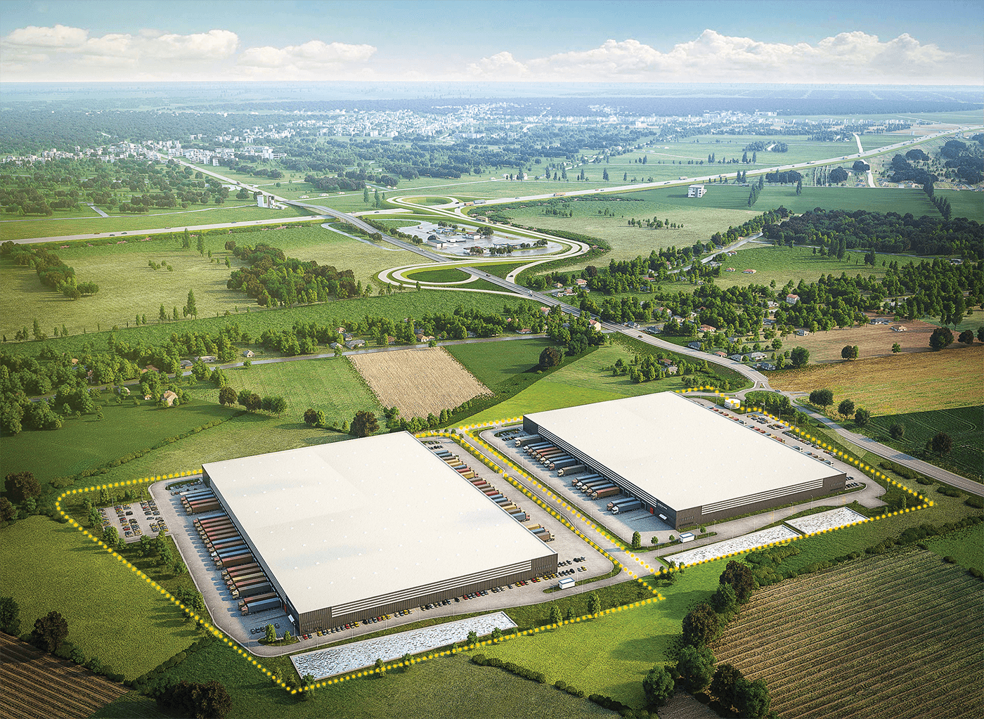
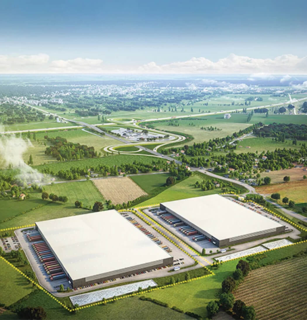
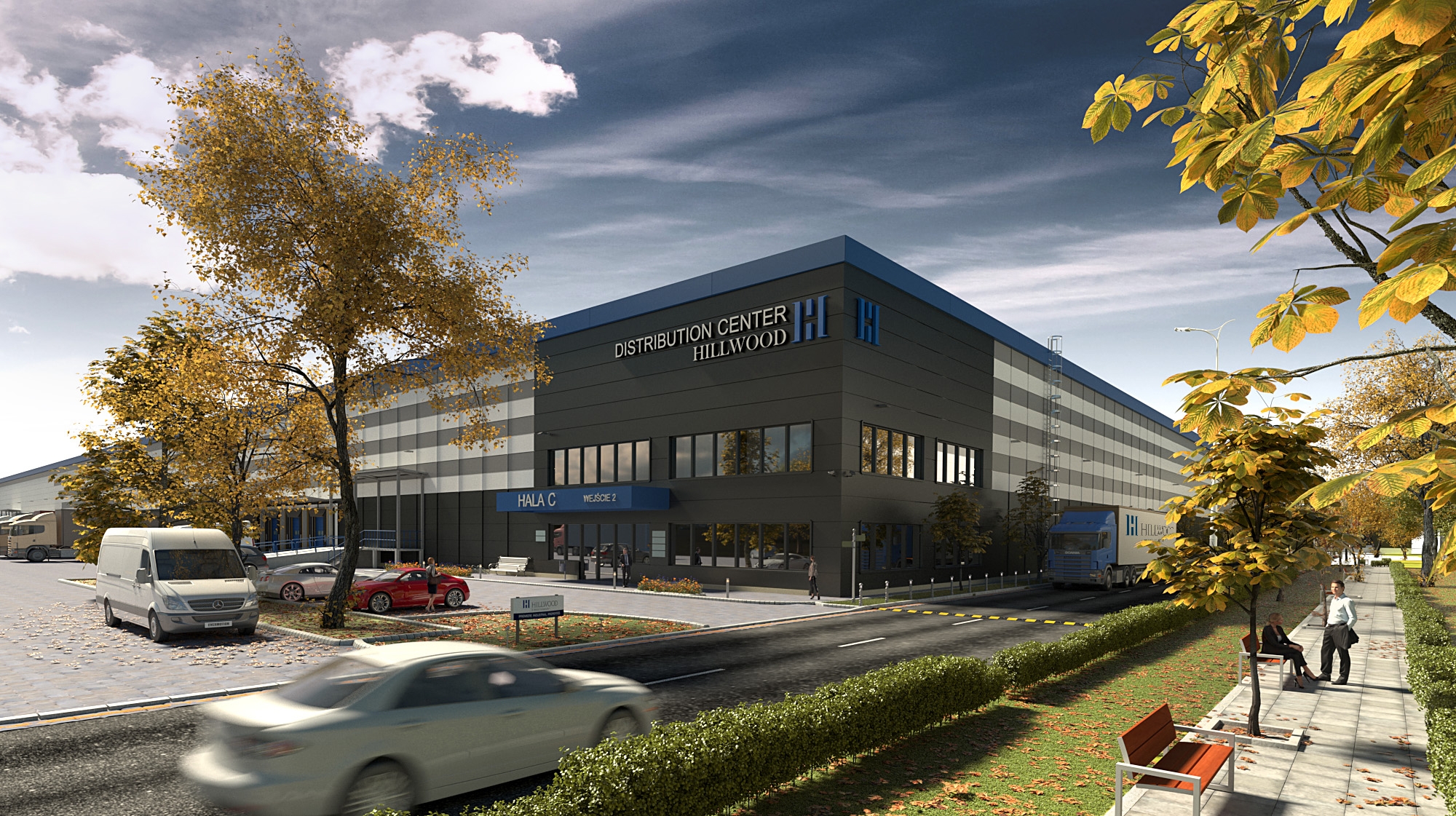
making photorealistic architectural visualizations (3D) depiciting the future company investment.
making computer animations depiciting key investments.
designing investment advertising brochures.
80+
visualizations
120+
maps and plans
30+
brochures
6
movies
Investment card
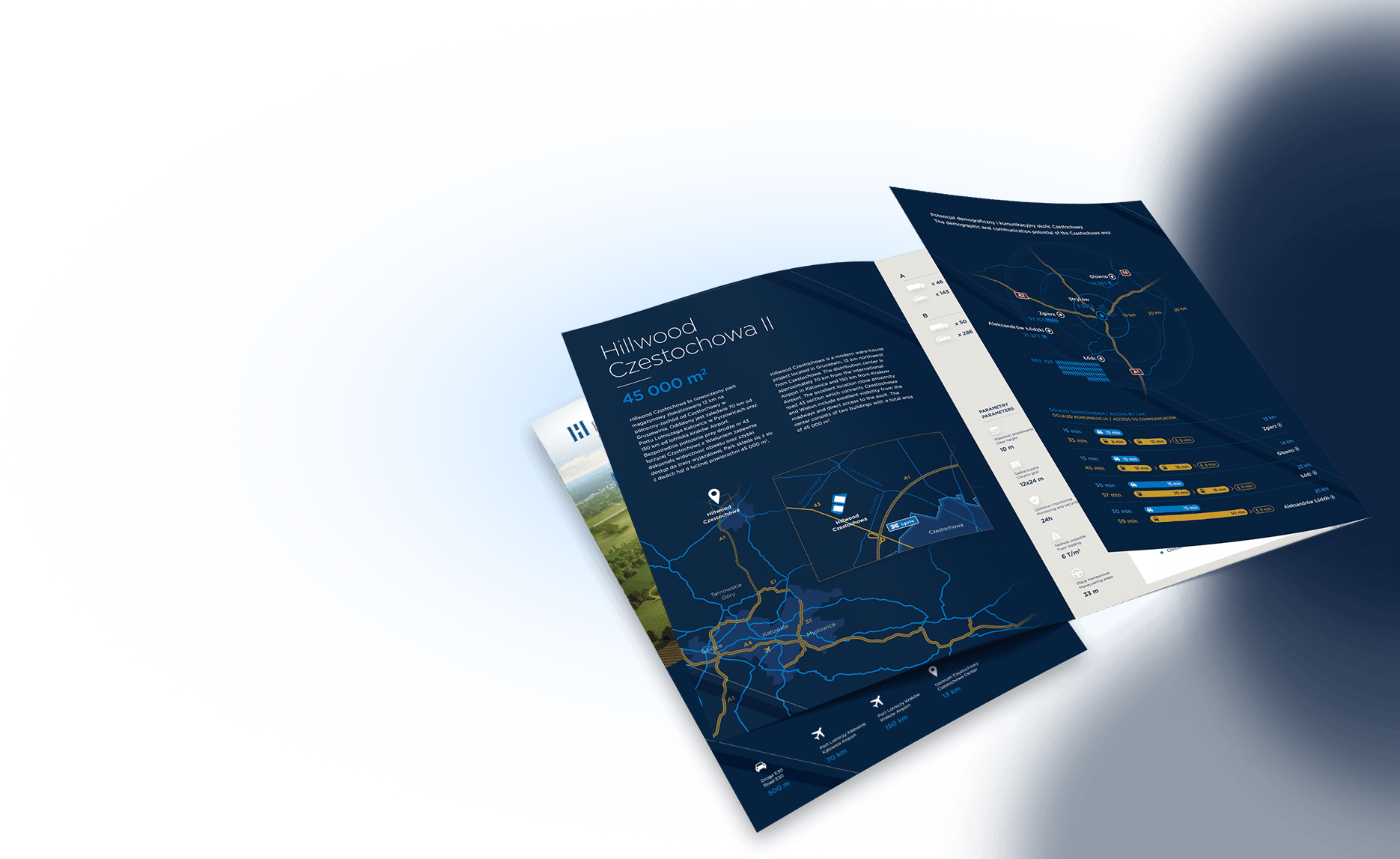
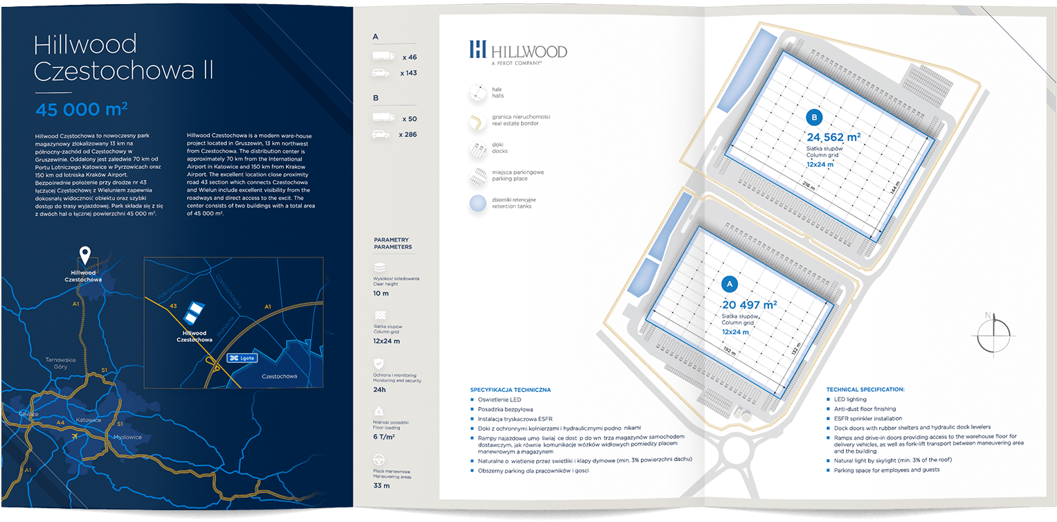
The main feature of the design is to convey the most important product features in a simple and legible way but not forgetting about being consistent and prestigious brand image. This is what we focused on.
The graphic design does not flood us with unnecessary graphic elements, and thanks to the iconography used, it allows easy adjustment of a large amount of information.
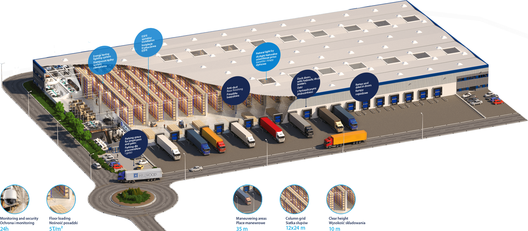
Infographic
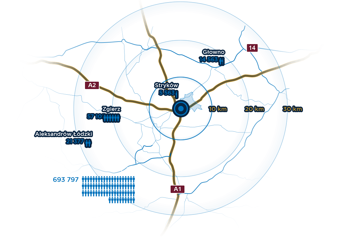
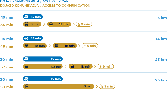
When designing infographic, we focused on providing information in a simple and memorable way. While maintaining a clear and modern style of designs, we used, a color division and commonly known symbols, thanks to which the image speaks for itself, and the user easily finds information that interest him.
Iconographic
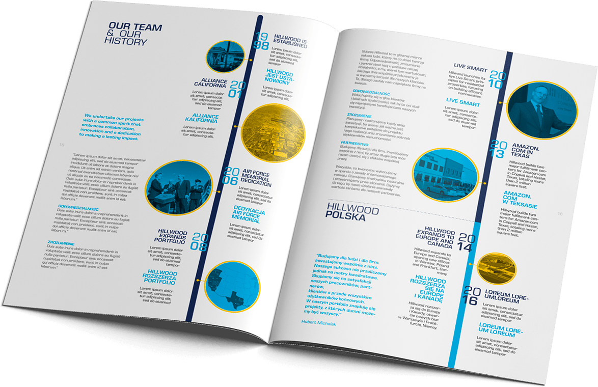
Company brochure
Above all Hillwood Poland is a high level of service, which is why it is so important that the presented investments are refined to the smallest details. While creating photorealistic visualizations, we make sure to maintain an exclusive look and bring the investment effect closer to the customer.
Content presentation
Consistency in the message is the idea behind our project. We design with detailed signs and we always take care of the details that combine the materials together. We make sure that the information is provided in a clean and schematic manner consistent with the brand identification.


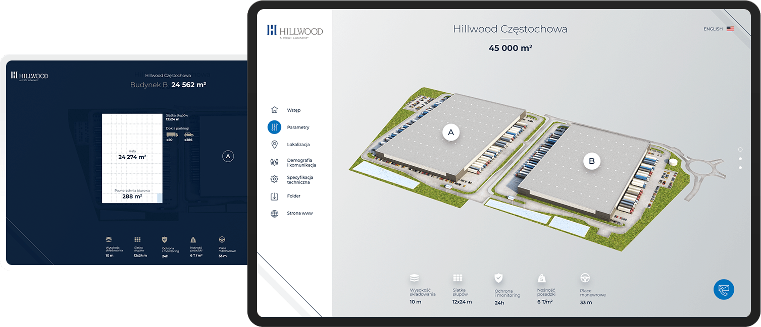
Interactive presentations
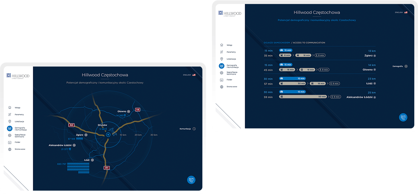
Creating an engaging interactive presentation is not just design knowledge. That technical capabilities of the devices are still developing and with them the expectations of the user. Therefore, when creating a message, we make sure that one click, reaches customer to the information he is interested in, and additional effects encourage him to continue browsing the offer.



Ergonomics of information
Designed by us interactive investment plans, with usable areas of some objects.
Focus on details
A transparent way of presenting content allows focusing attention only on the infrastructure that interests us without unnecessary distraction of attention to other surfaces.
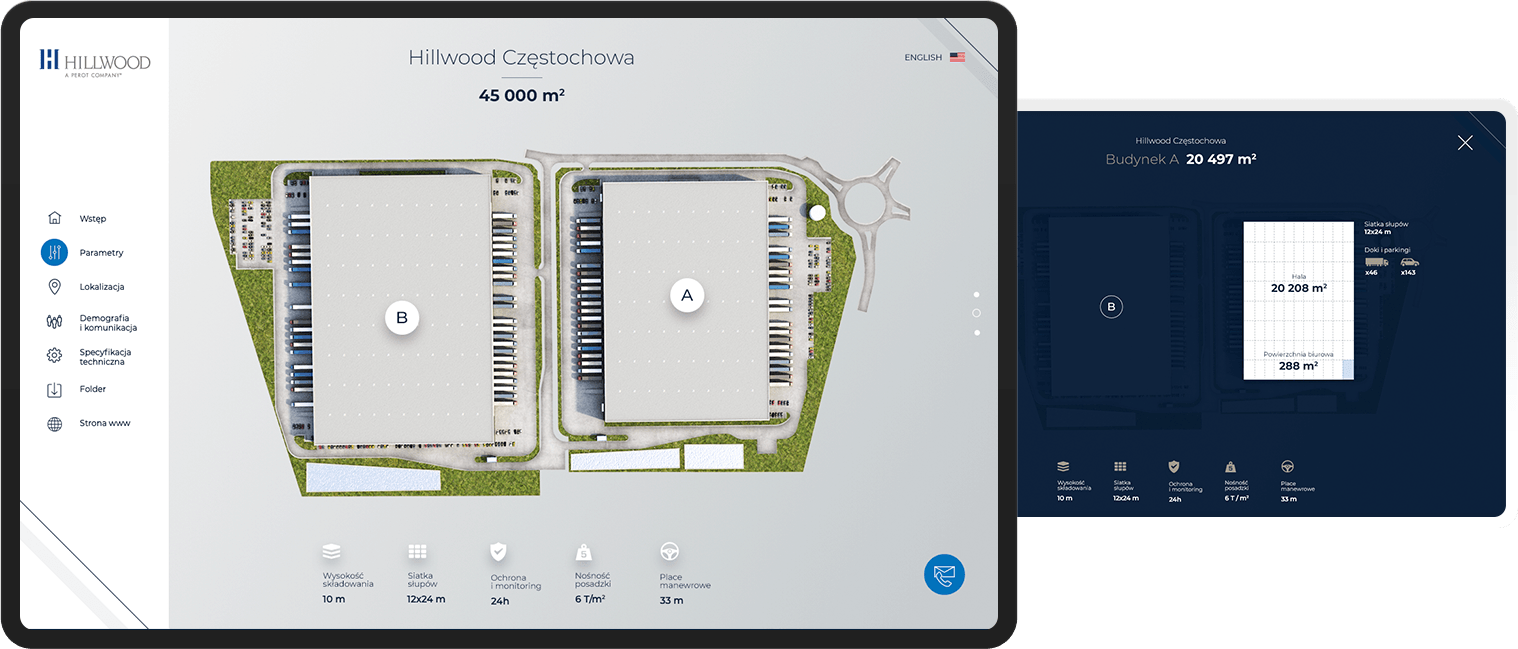

Easy of communication
The information presented is dosed to users in thematically coherent segments. This allows for better assimilation of information.

