
HILLWOOD
HILLWOOD
Hillwood is one of the largest real estate companies that has been building and investing around the world for 25 years, focusing on activities related to the purchase, financing and construction of warehouses and industrial facilities for long-term rental in Poland.
ABOUT
PROJECT
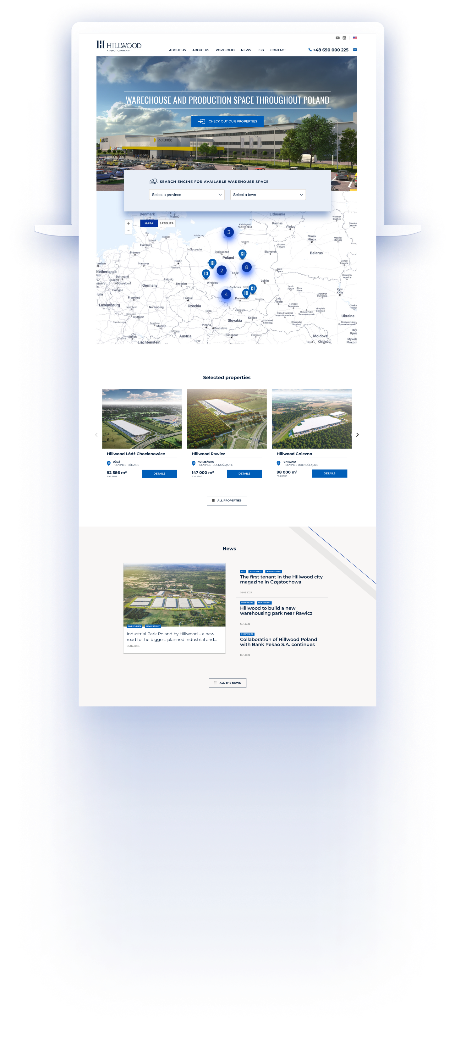
The assumption was to create a modern and functional website that will go to representatives of logistics companies, production, e-commerce and agencies dealing with the rental of warehouse spaces.
UX / UI
DESIGNWORDPRESS
DEVELOPMENT3D
RENDERSTIMELINE

MAIN GOALS
GOALS
EASY OF SEARCH
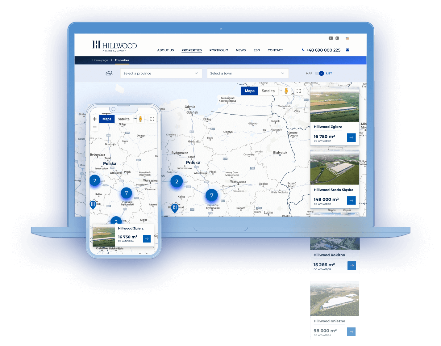
Maximum simplification of the process of finding a property in accordance with the needs of the tenant.
VERSALITY
Creating a scalable solution that meets the expectations of various users. From small businesses to global corporations. From business owners seeking warehouse spaces to professional real estate agents.
USER FRIENDLINESS
Achieving high usability of the process of viewing the full set of parameters of the selected property.
WIREFRAMES
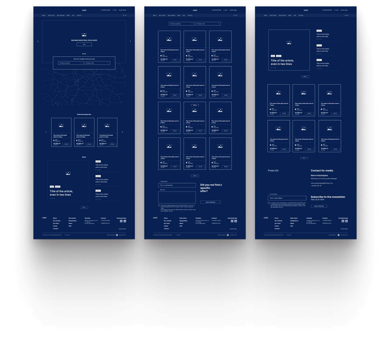
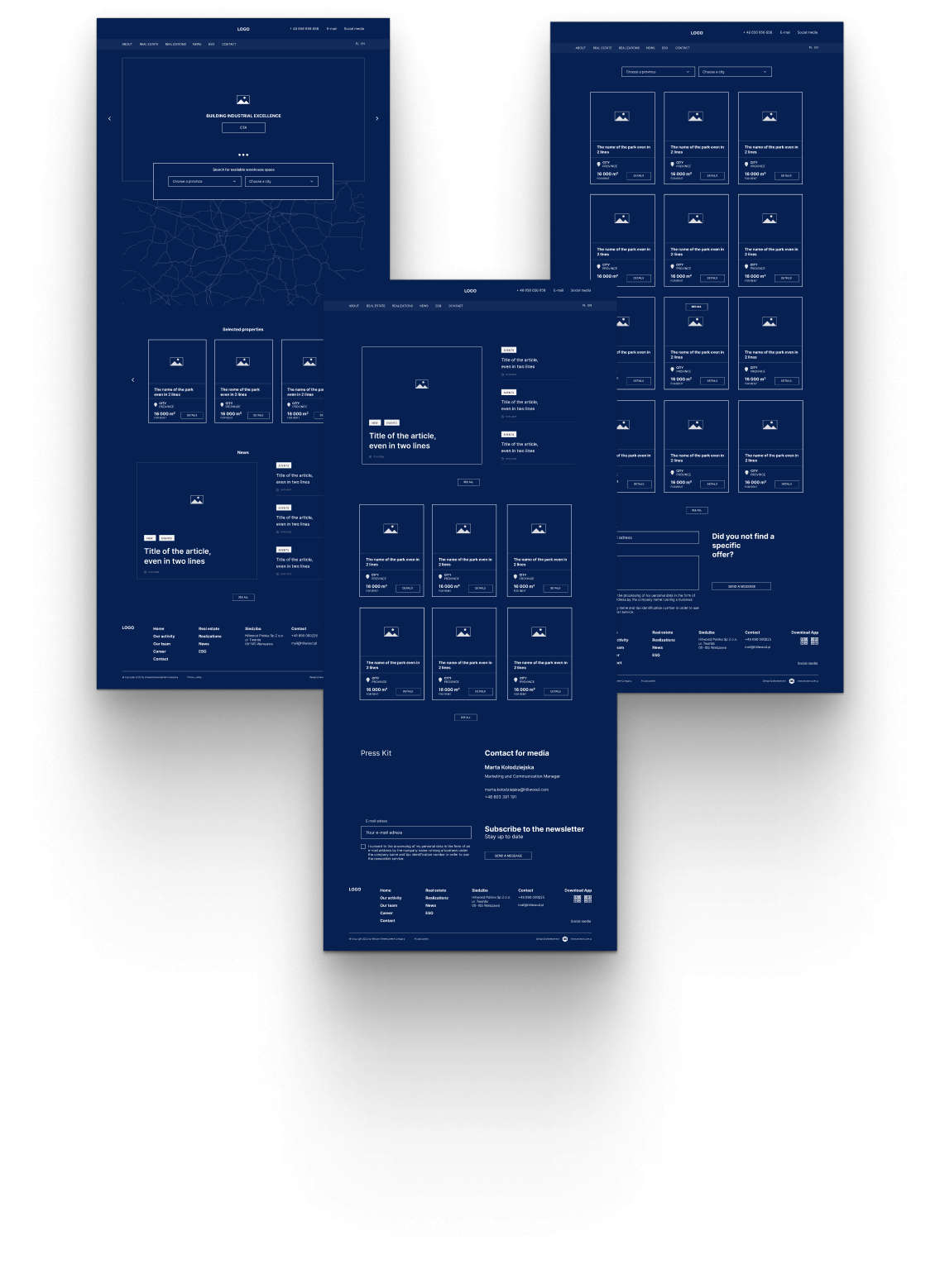
At the usability (UX) design stage, our understanding of user needs was translated into a structured, easy-to-navigate and intuitive interface scheme. Wireframes were then generated, allowing for the verification of initial assumptions and providing a foundation for UI design.
LAYOUT
GRID

GUI design began with the selection of grids. The priority was the clear presentation of a considerable amount of information on different devices.
REAL ESTATE PAGE
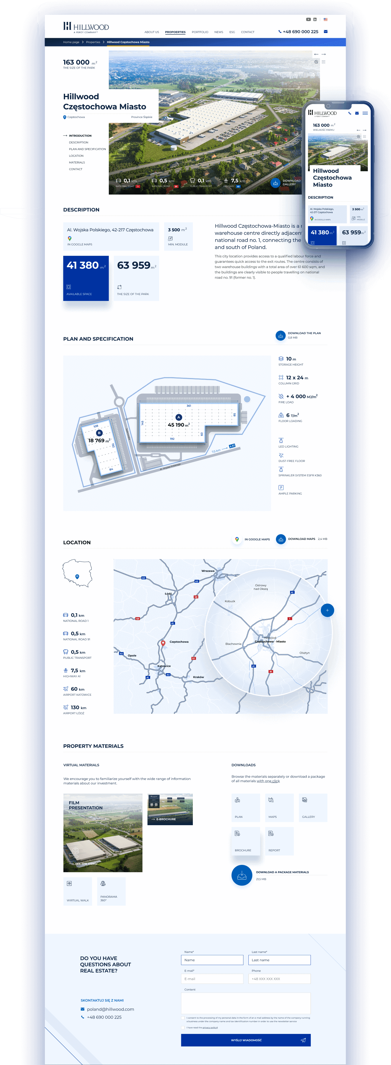
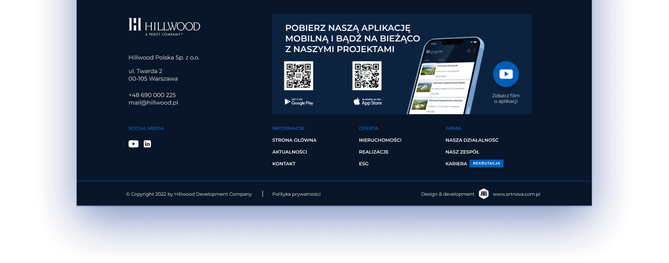
WEBSITE STRUCTURE

TYPOGRAPHY
MONTS
ER
Montserrat
Regular Bold
RAT
Montserrat
Regular Bold
MONTS
ER
RAT
Montserrat
Regular Bold
COLORS
Navy
0A1528Gold
CB9700Blue
0033A0Light blue
F0F6FFRESPONSIVENESS
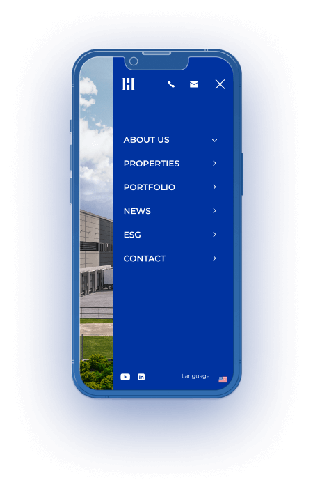
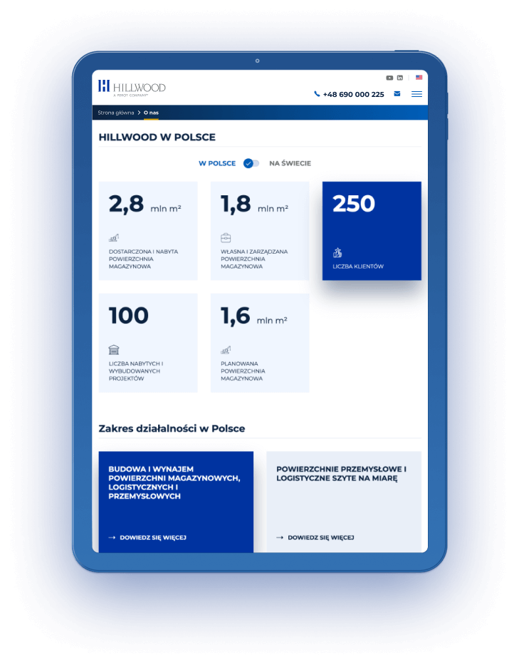
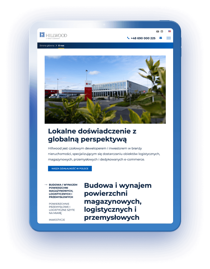
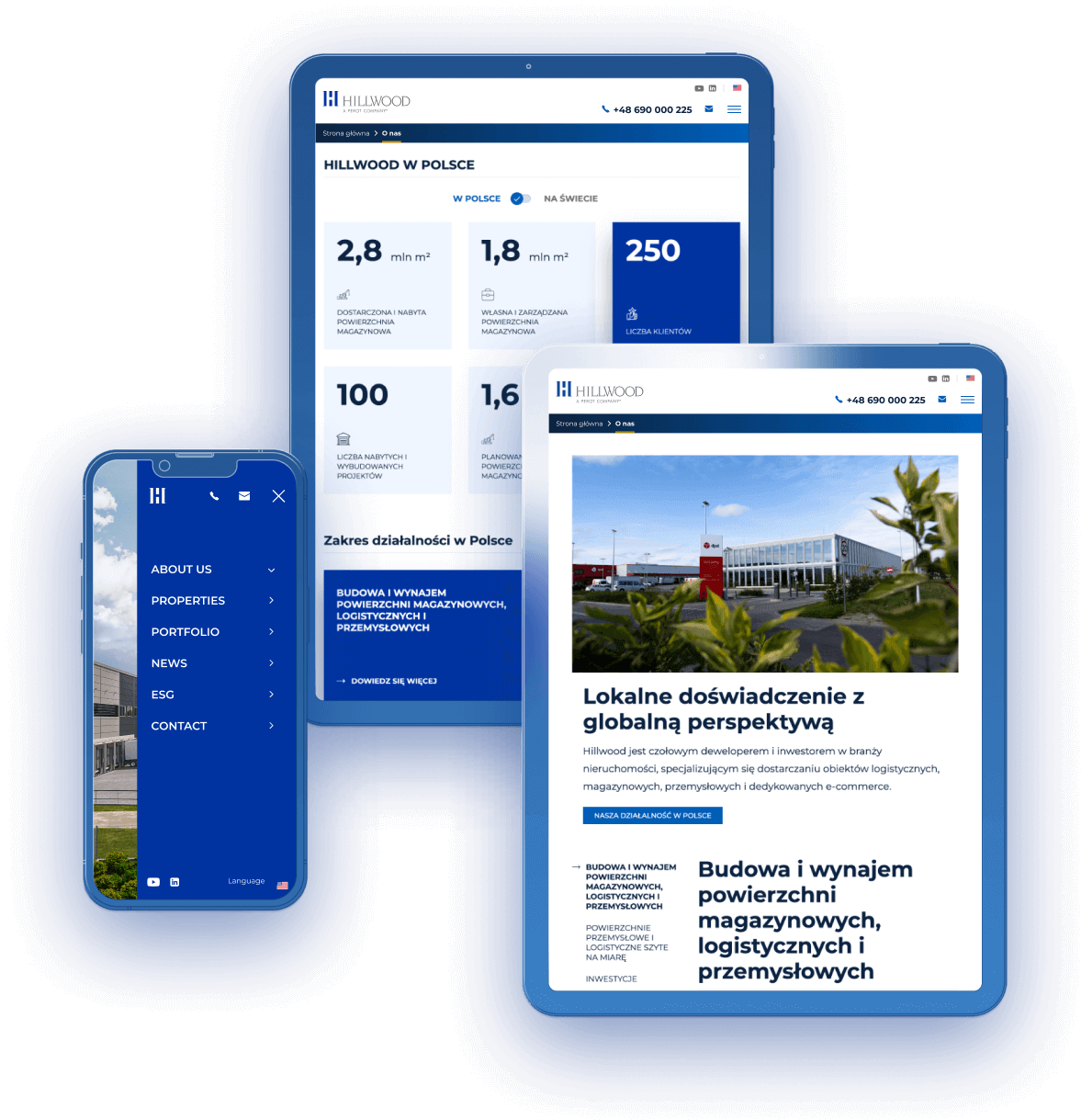
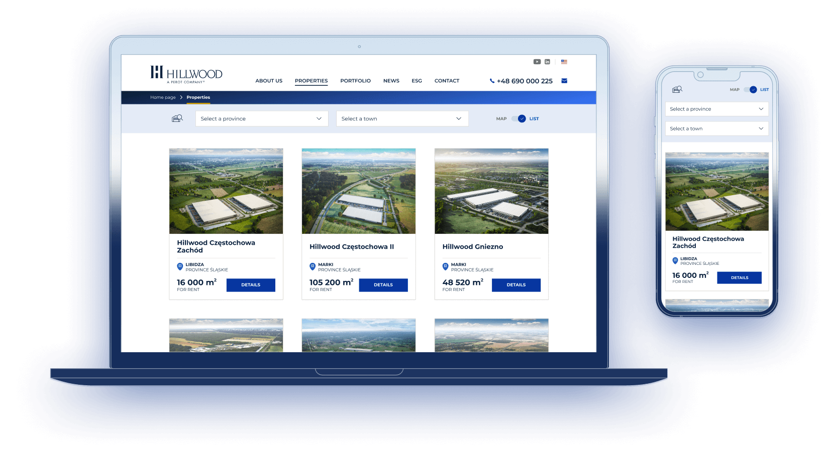
The devices and circumstances in which different users access the functionality and content of the site set high demands for the responsive versions. The challenge was to maintain graphical consistency with comparable usability of interfaces.
RESPO
NSIVE
Mobile/Tablet
The project included separate design paths for the desktop, tablet and smartphone interfaces.
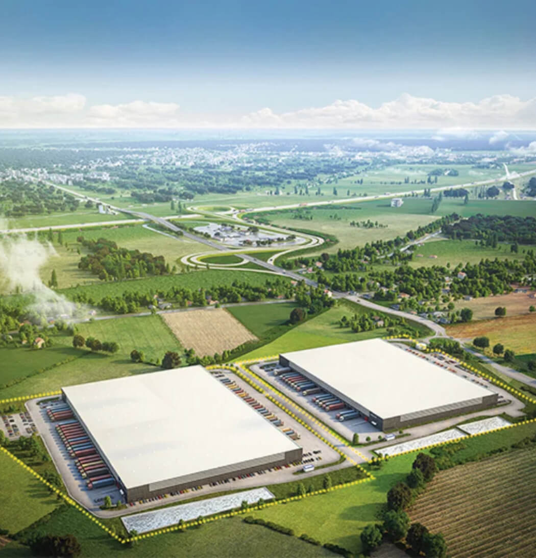
3D RENDERS
3D RENDERS
3D RENDERS
3D RENDERS
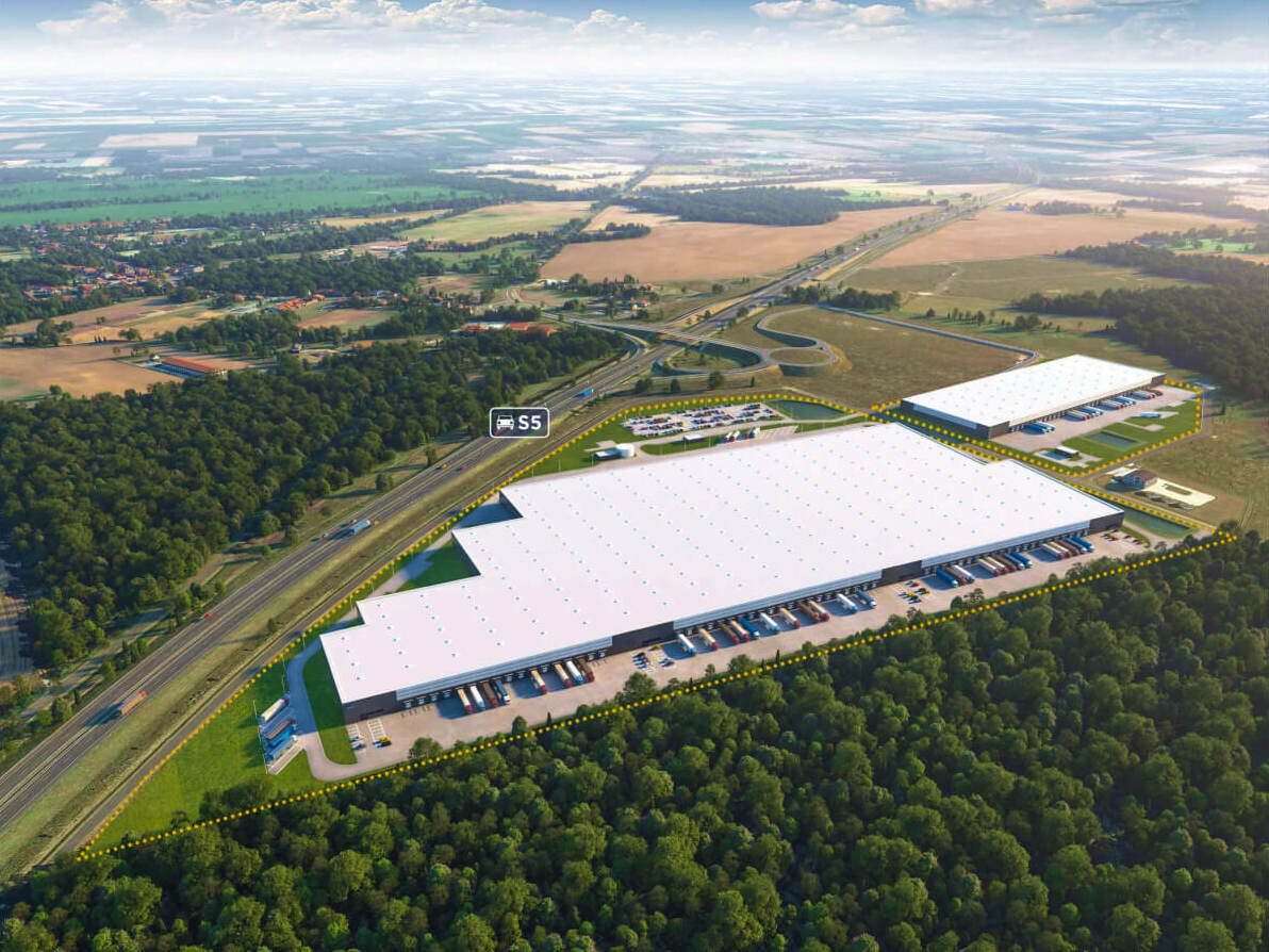
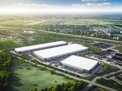
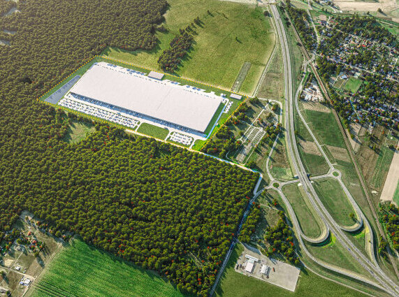
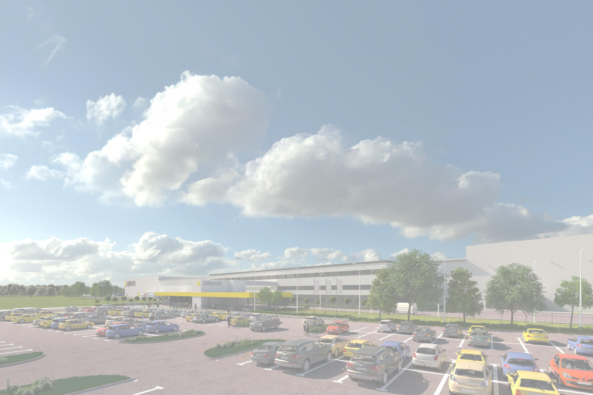
For the project, we created 3D renders of Hillwood's warehouse properties. The use of renders allowed us to present potential clients with a realistic look of both existing and planned facilities
