
Discover a world of fun with Tuli Fun!

About Logo
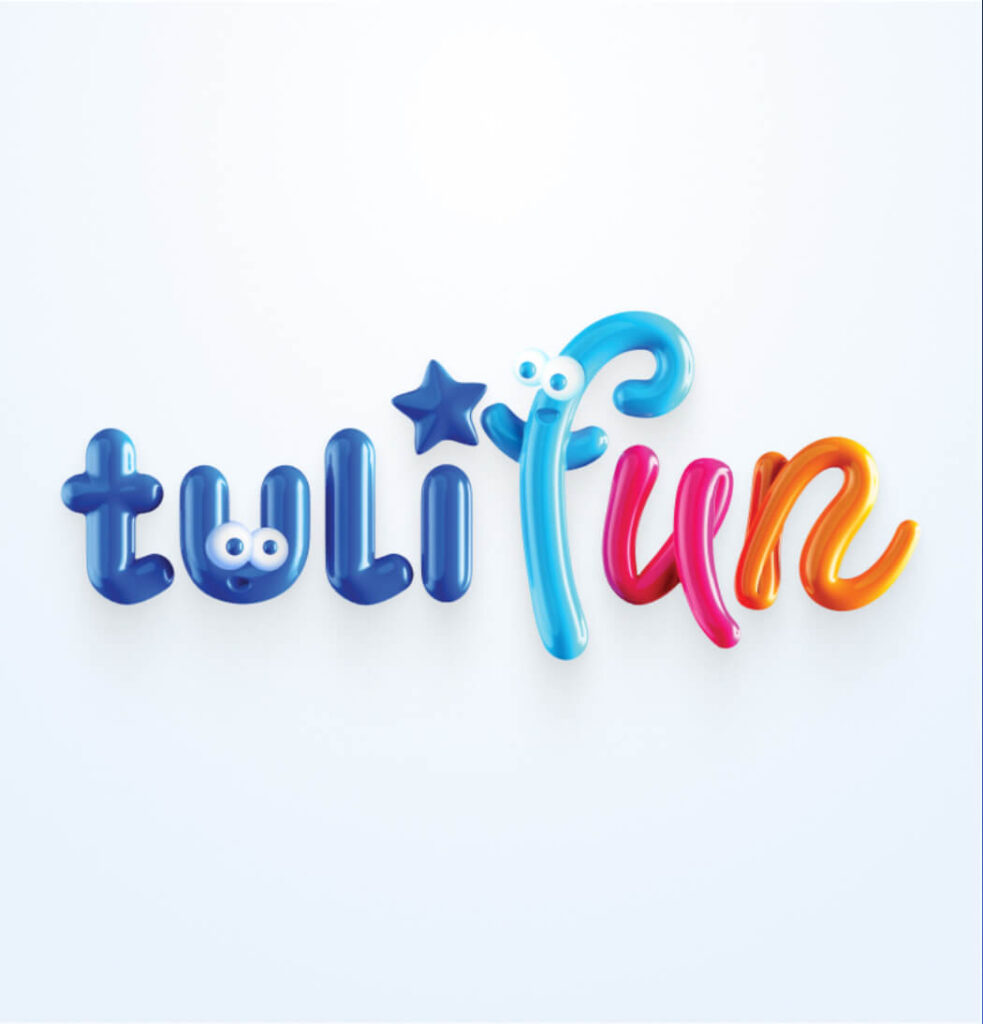
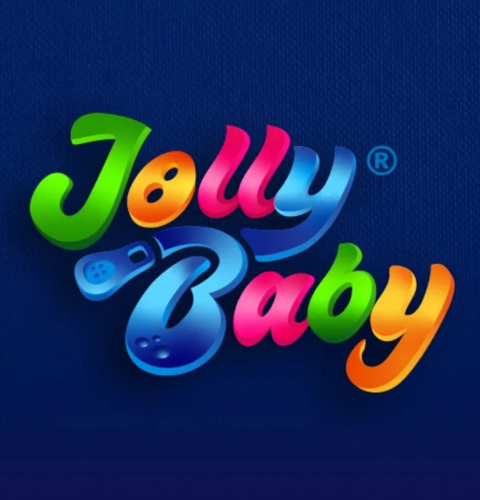
The combination of navy blue, blue, pink and orange in the Dumel Tuli Fun logo can create a harmonious and visually appealing combination that reflects the brand's values, draws attention and attracts both children and adults.

Typography
The Core Sans Rounded font has rounded letter shapes. It is friendly and pleasing to the eye. It has elegant and legible letters that are rounded on the edges, which gives them a soft and pleasant look.


Icons
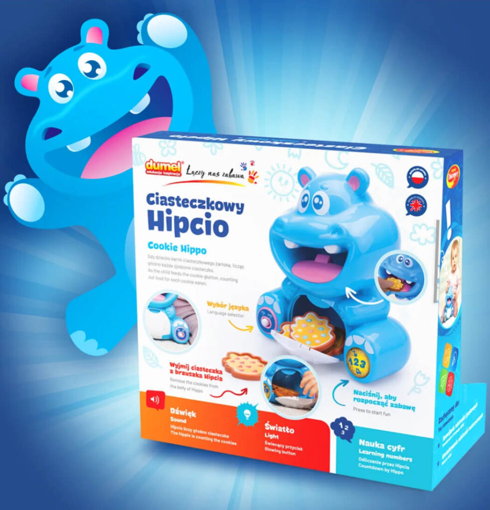
The icons act as graphic descriptions of the functions or features of the toy included in the package. For example, if a toy emits sounds, a speaker icon could symbolize that feature.
Functional
Icons
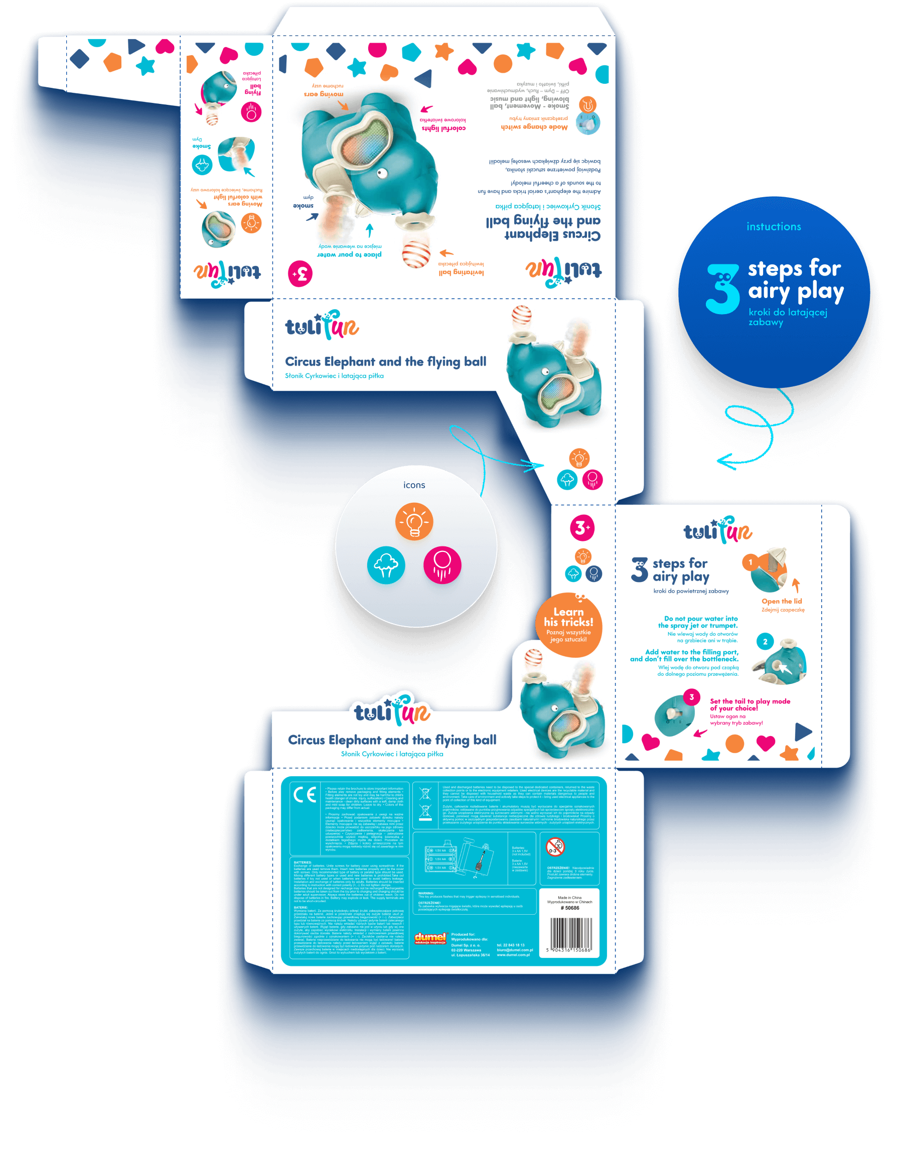
Icons on packaging have the potential to enrich the shopping experience, providing both information and interaction for children and their parents.
Senses
stimulation


Packaging design


Packaging done in a minimalist design. The packaging contains clear and legible information about the product, age, features and benefits they offer.


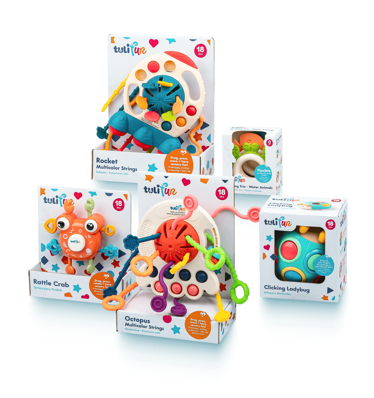


Funny elements


We've combined numerals with playful facial elements, such as eyes and lips (used in the logo). This way, we showcase the main features of the toys in an attention-grabbing manner.
