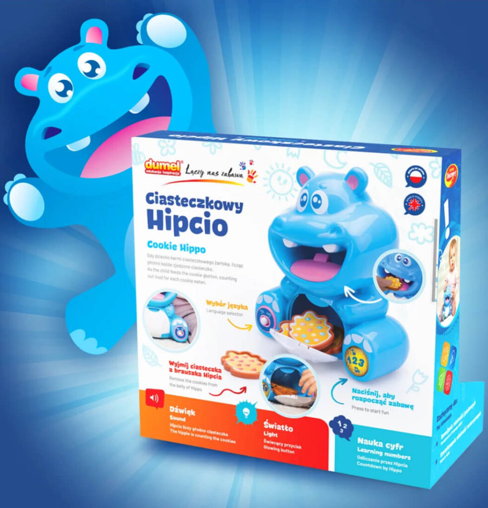


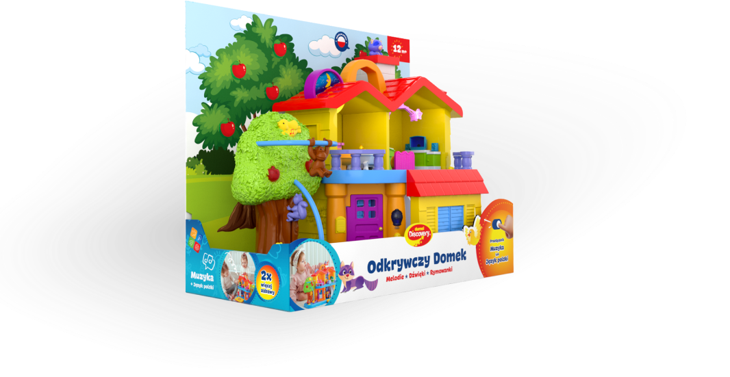
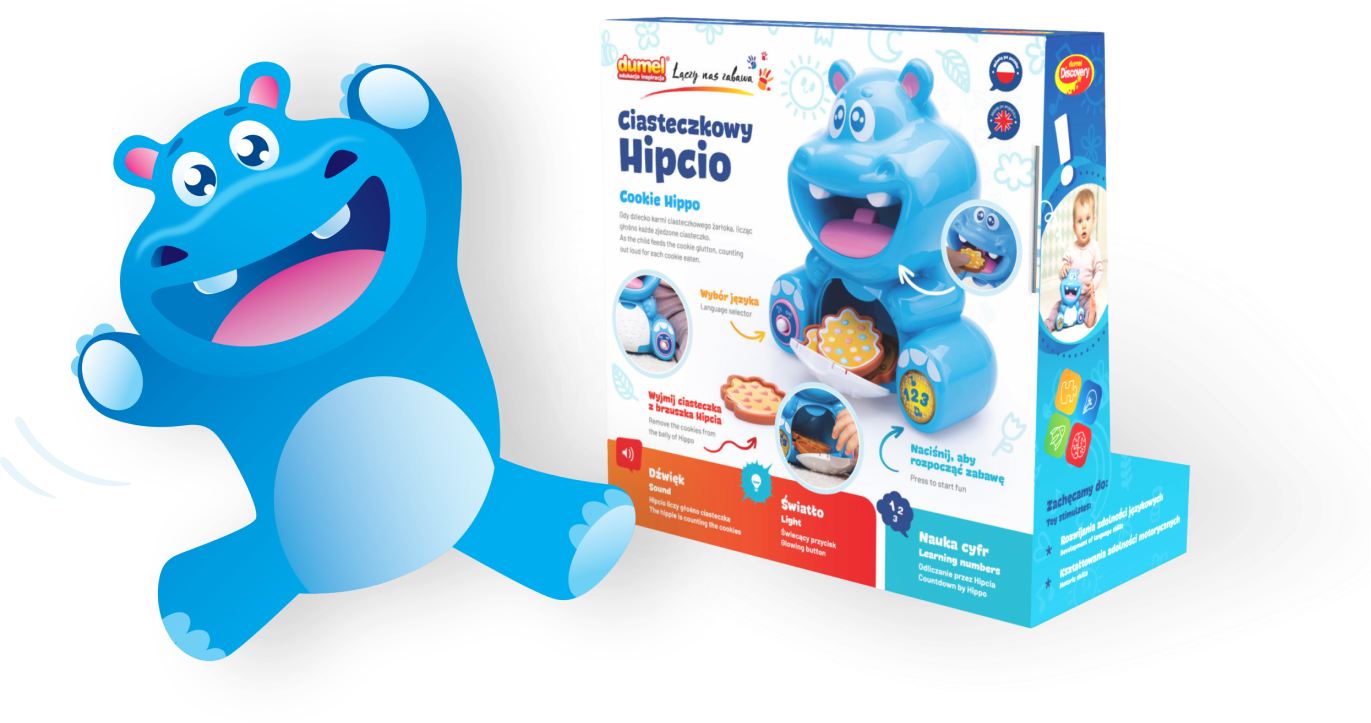
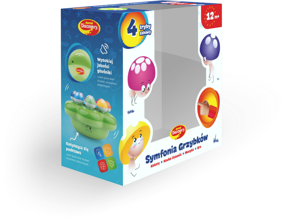
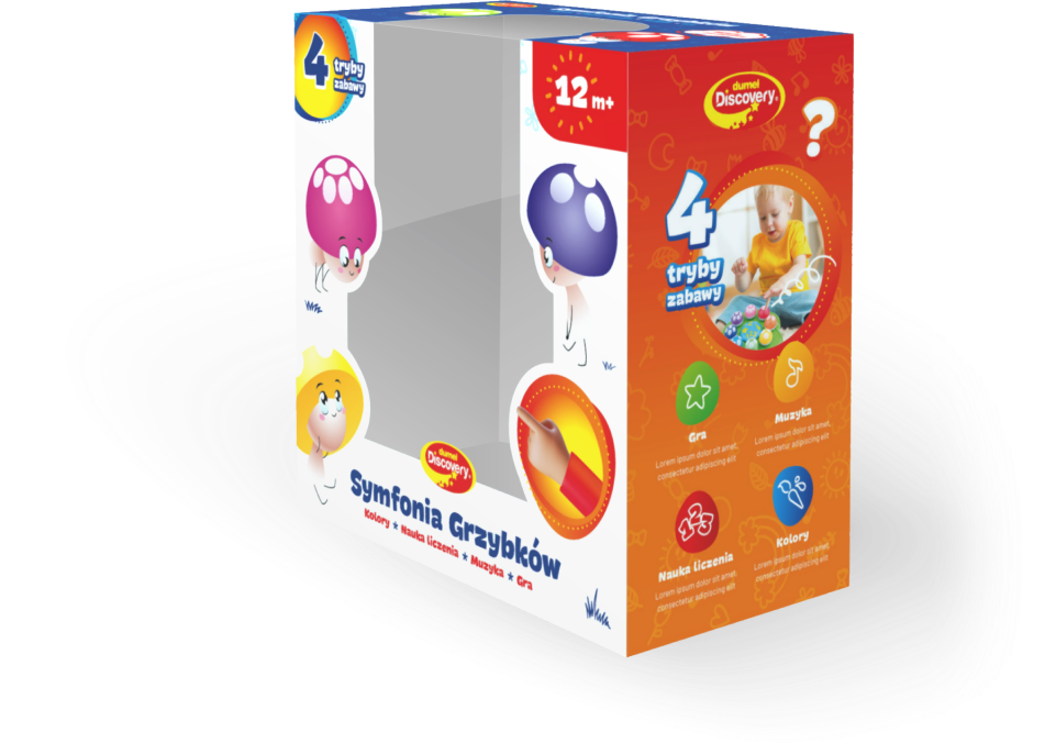
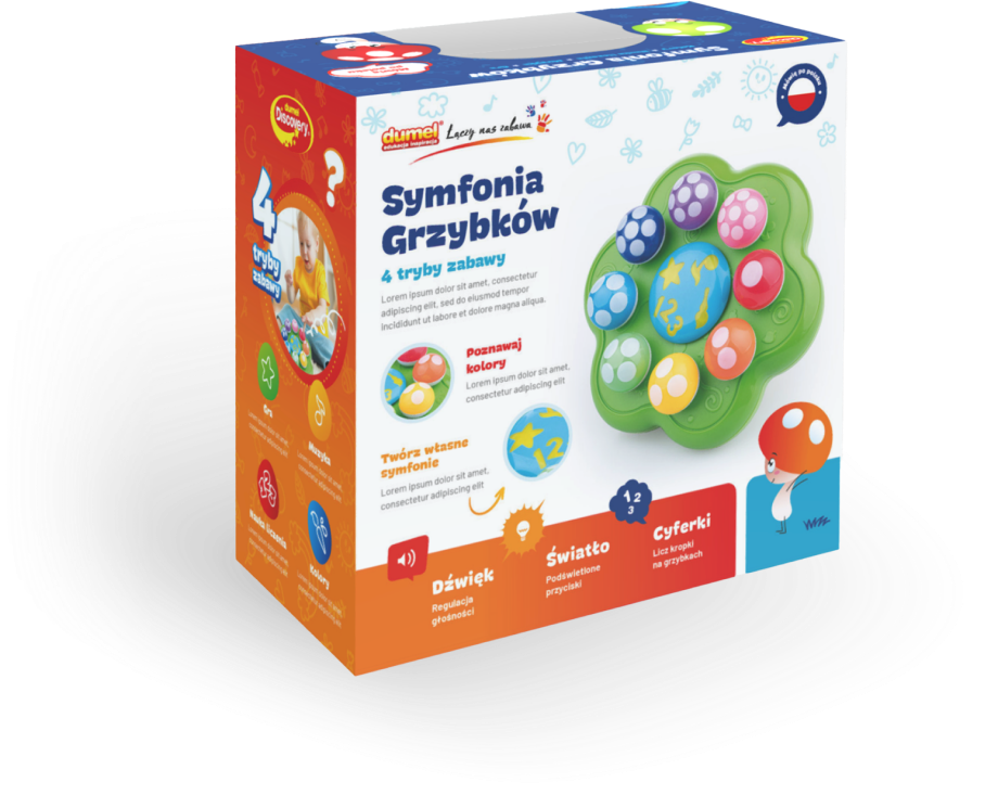
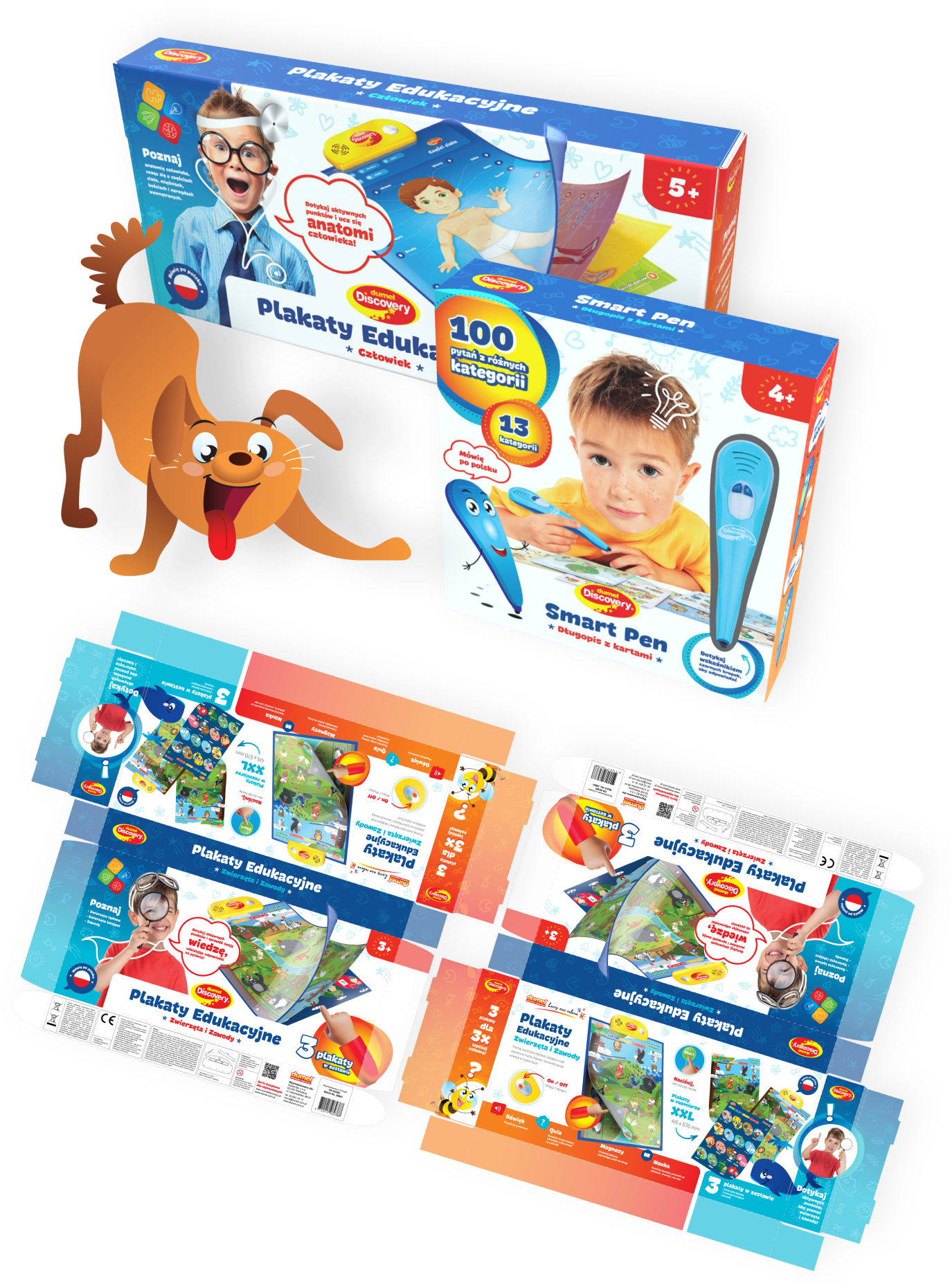
We are delighted to present another edition of the Dumel Discovery packaging series. As with previous projects for the brand, the goal was to unify the brand image and differentiate the products on store shelves by giving them a fresh and eye-catching look.
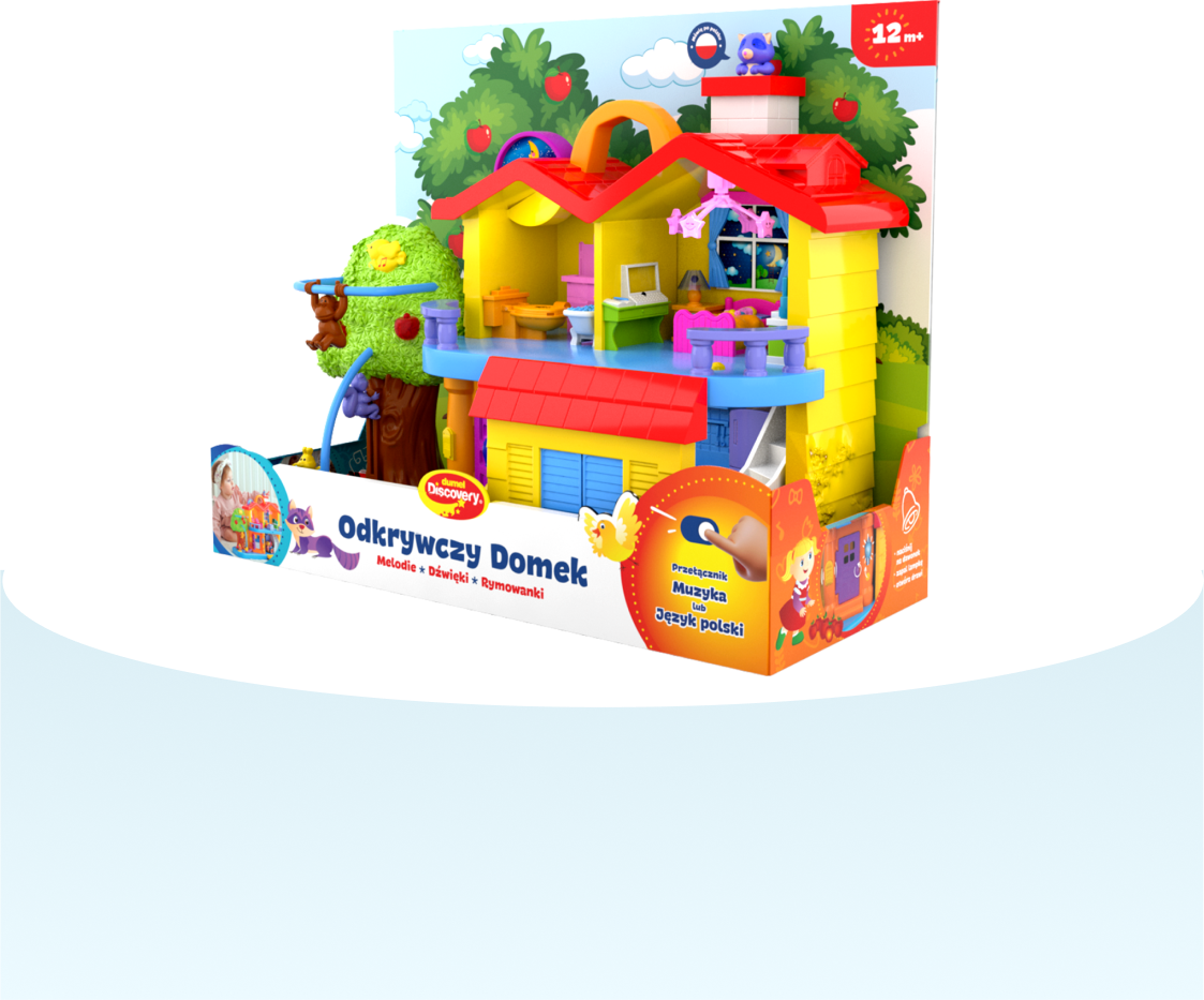
Dumel Discovery educational and interactive toys are friendly and suitable even for very young children. They develop imagination and encourage activity. Working with them was a great pleasure.


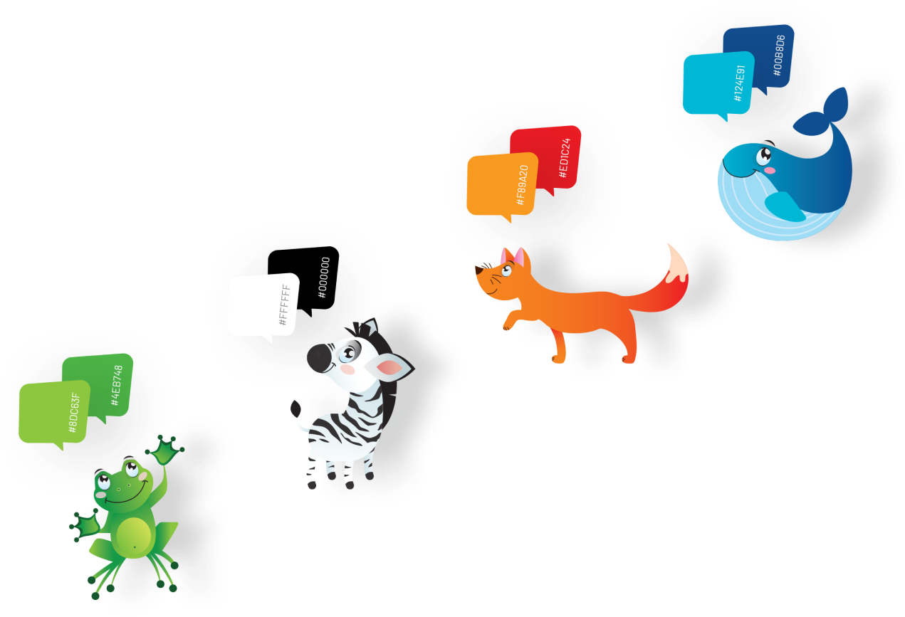
Color
When creating packaging for children, we used bold colors to help children discover the world and develop curiosity, skills, and creativity.
Typography
When selecting the font, we looked for a clear and easy-to-read typeface. The font's playful and cheerful form, which attracts the attention of young people, influenced the final choice.


Visual message
Feature presentation
We used graphic elements to present all the essential features of the product in a fun and creative way.
Invitation
to play
We designed expressive icons to pique children's curiosity and encourage them to discover the toy's functions.
Function
We relied on the universality of graphic symbols to make them friendly for both adults and children. As a result, parents can quickly understand the product almost without using words. Children, on the other hand, can easily find their favorite functions and immerse themselves in the world of play.
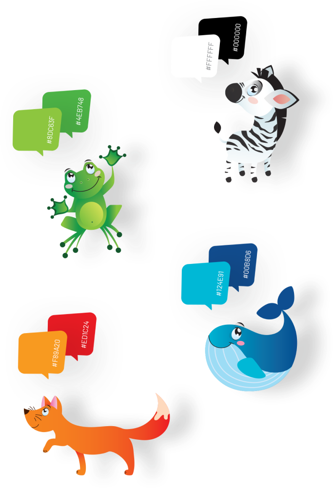
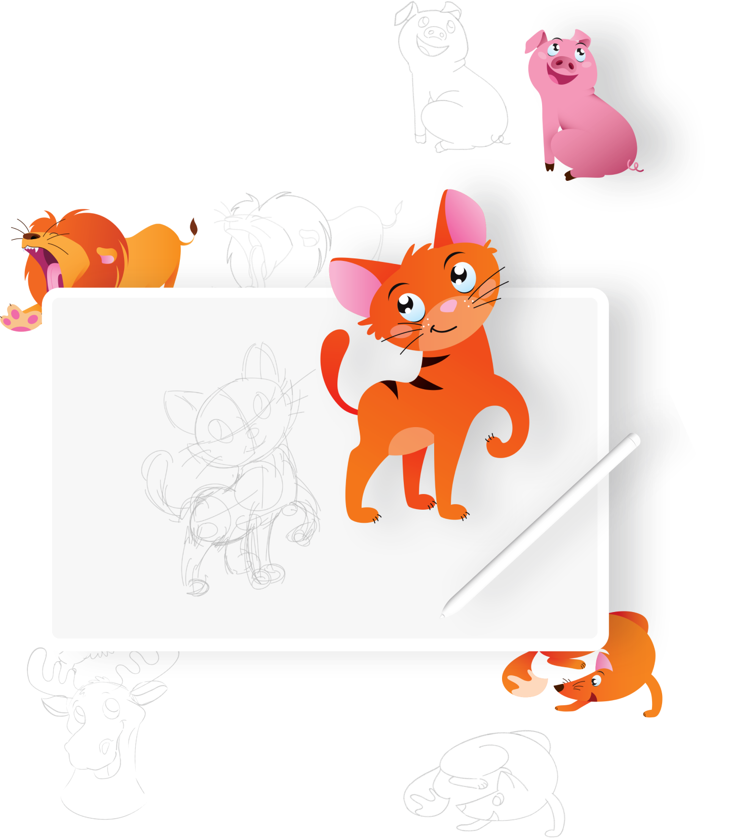
Drawings
When creating graphics, we appealed to associations that are familiar and close to children. We chose a simplified style of illustration that leaves room for imagination.


Icons
We designed a set of icons to support the graphics of the entire project. We used icons as a visual navigation element to facilitate getting to know the product.

Recognizability
We focused on the recognizability and immediate understanding of the icons. We opted for clear shapes and dynamic asymmetry, which allowed us to achieve a balanced composition of the final elements

Consistency of use
In our pursuit of a professional brand image, we paid particular attention to maintaining the consistency of the icons used. We carefully refined the style, color scheme, and dimensions of the graphics used.